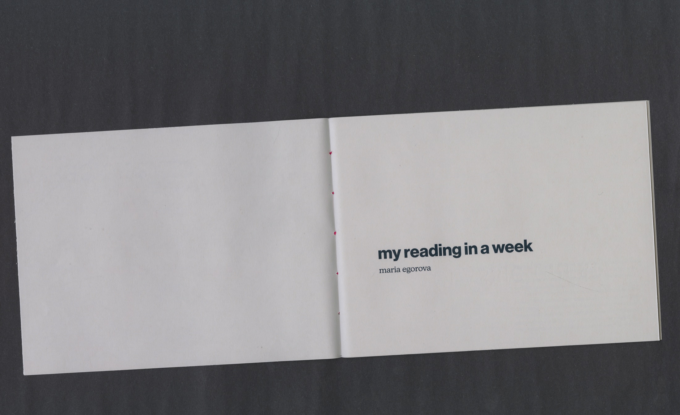
my reading in a week
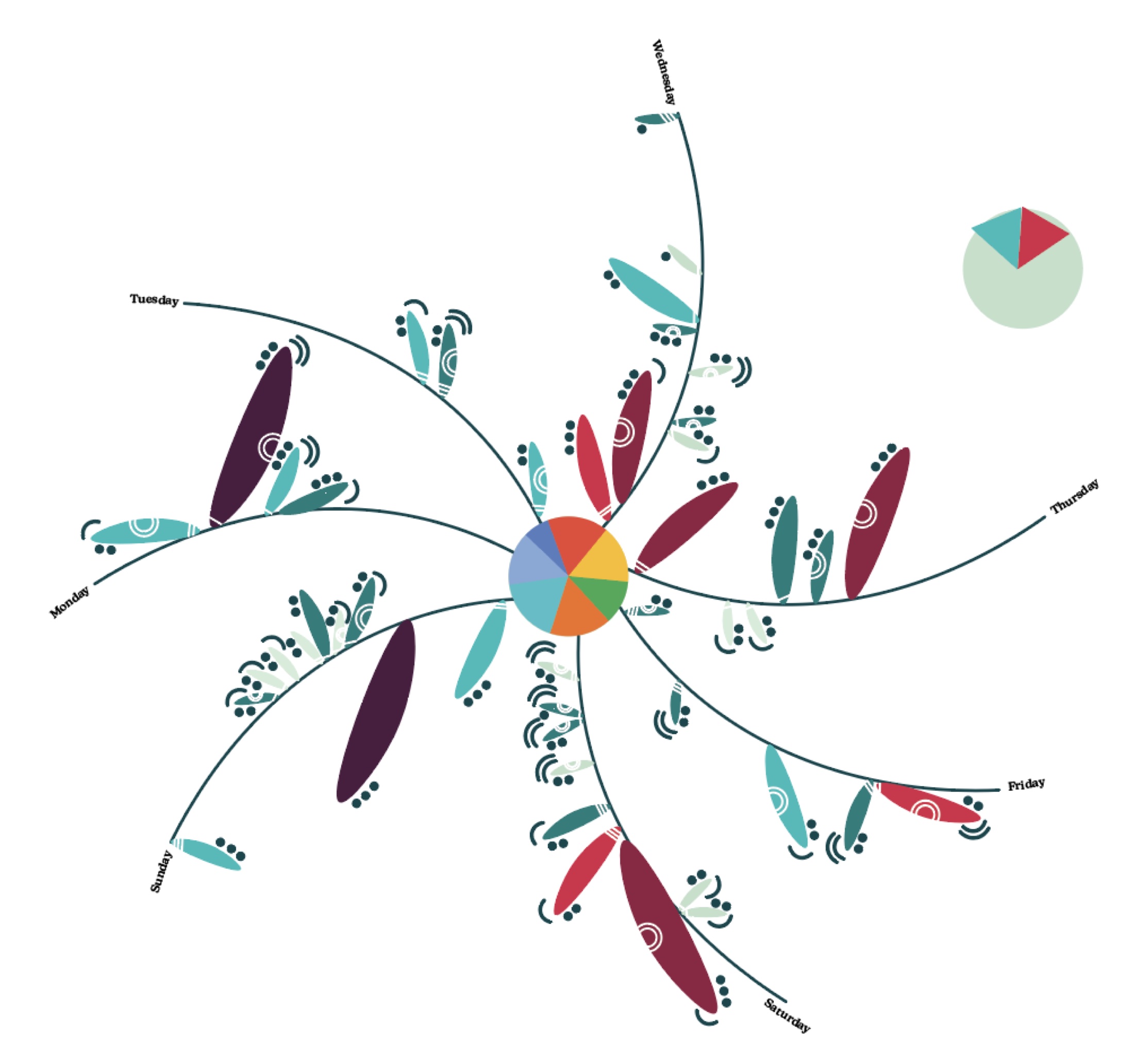
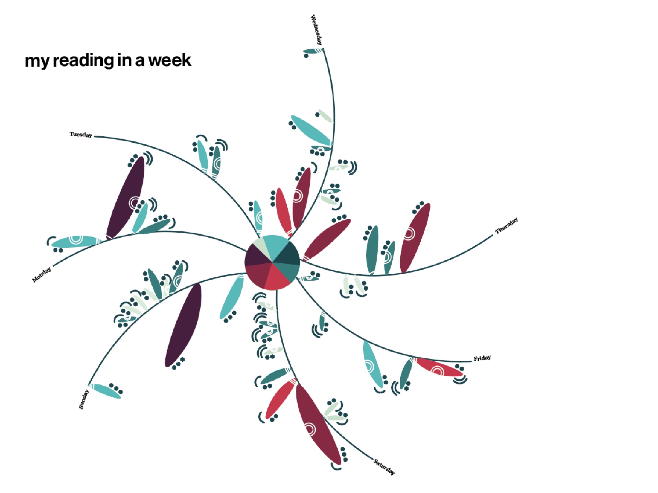
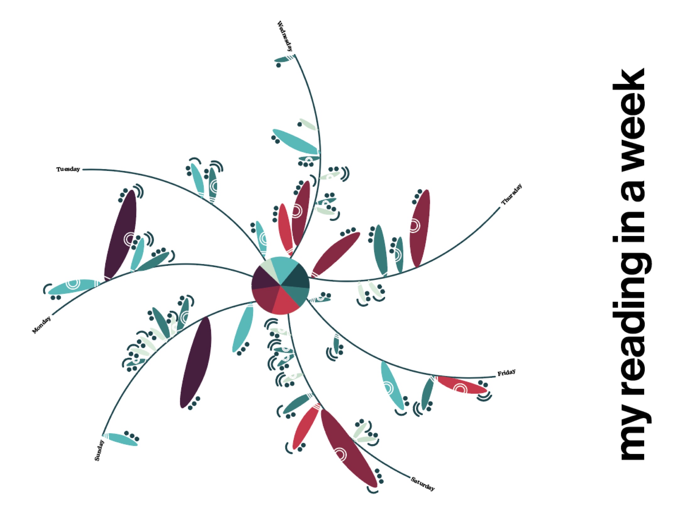
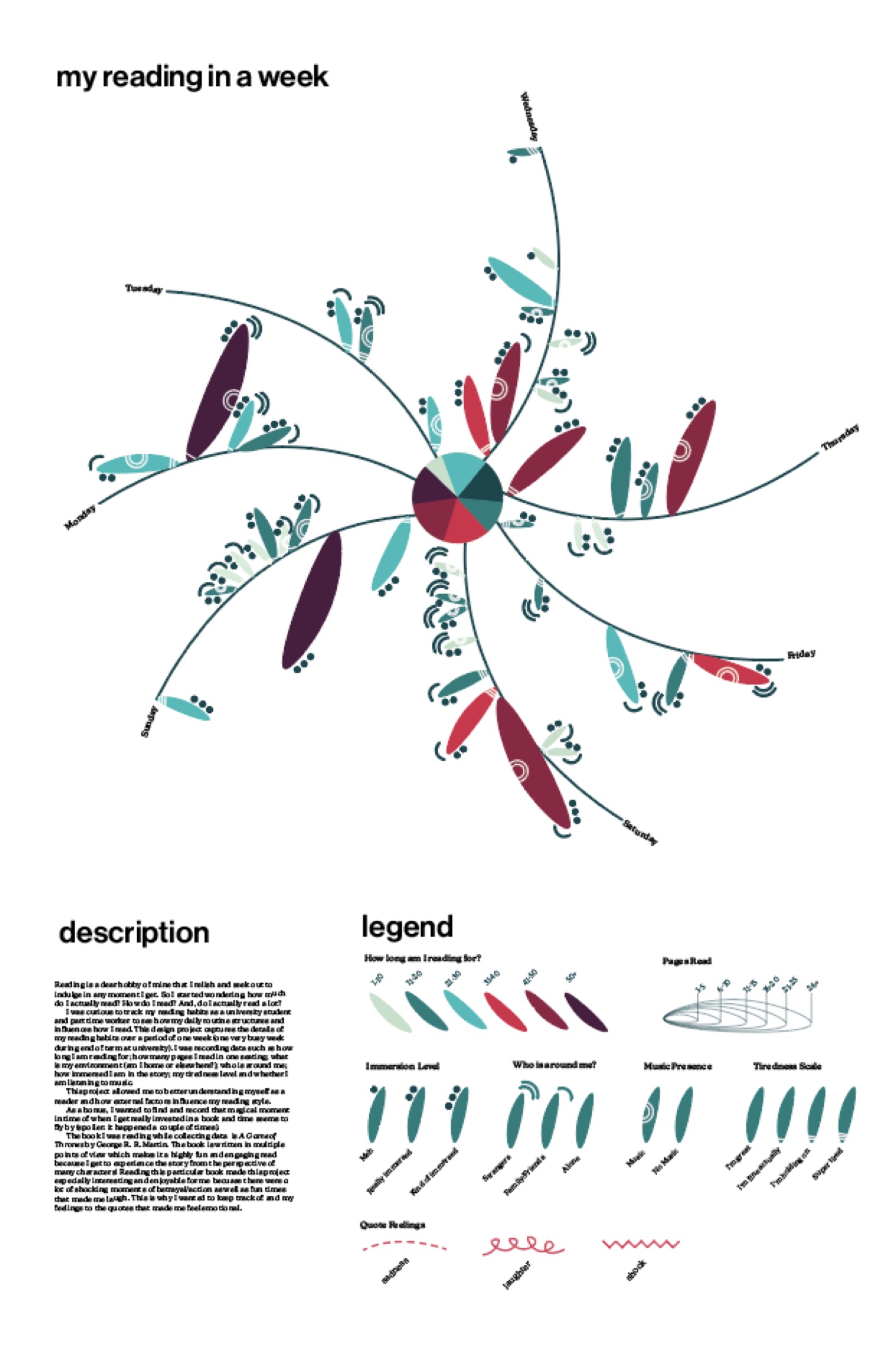
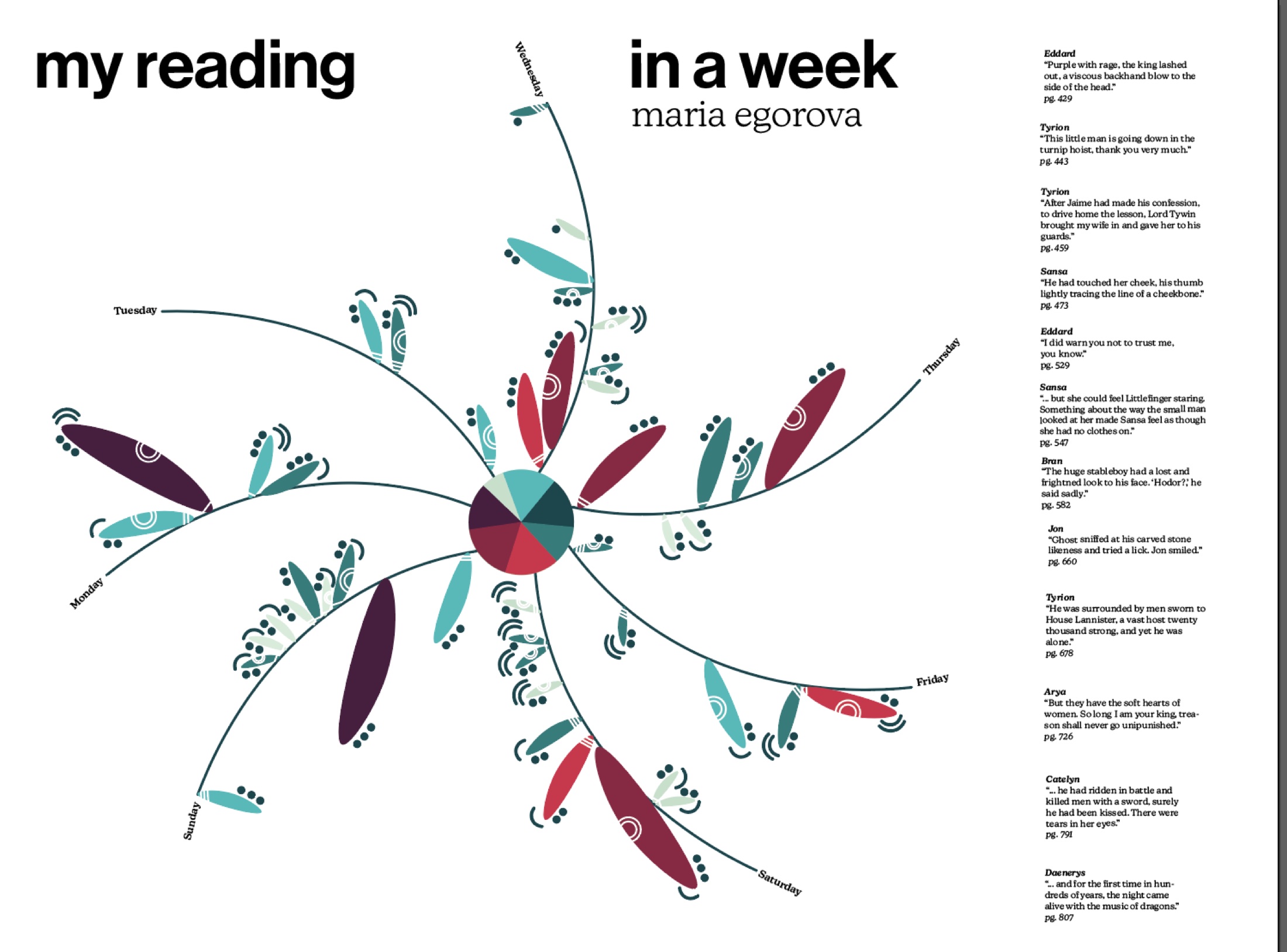
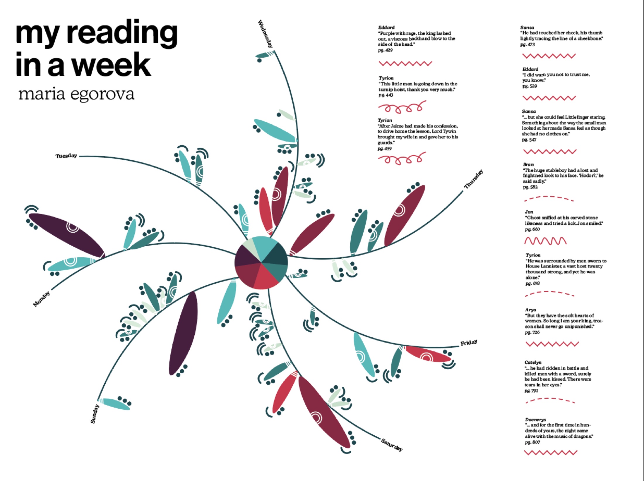
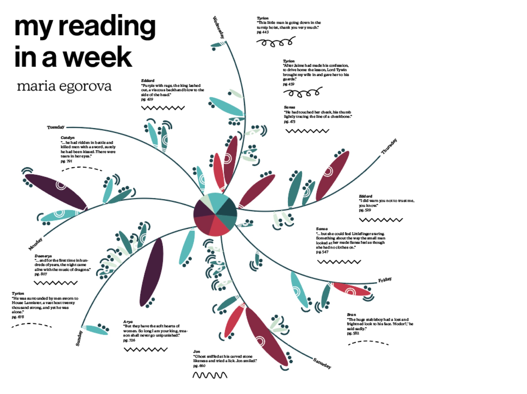
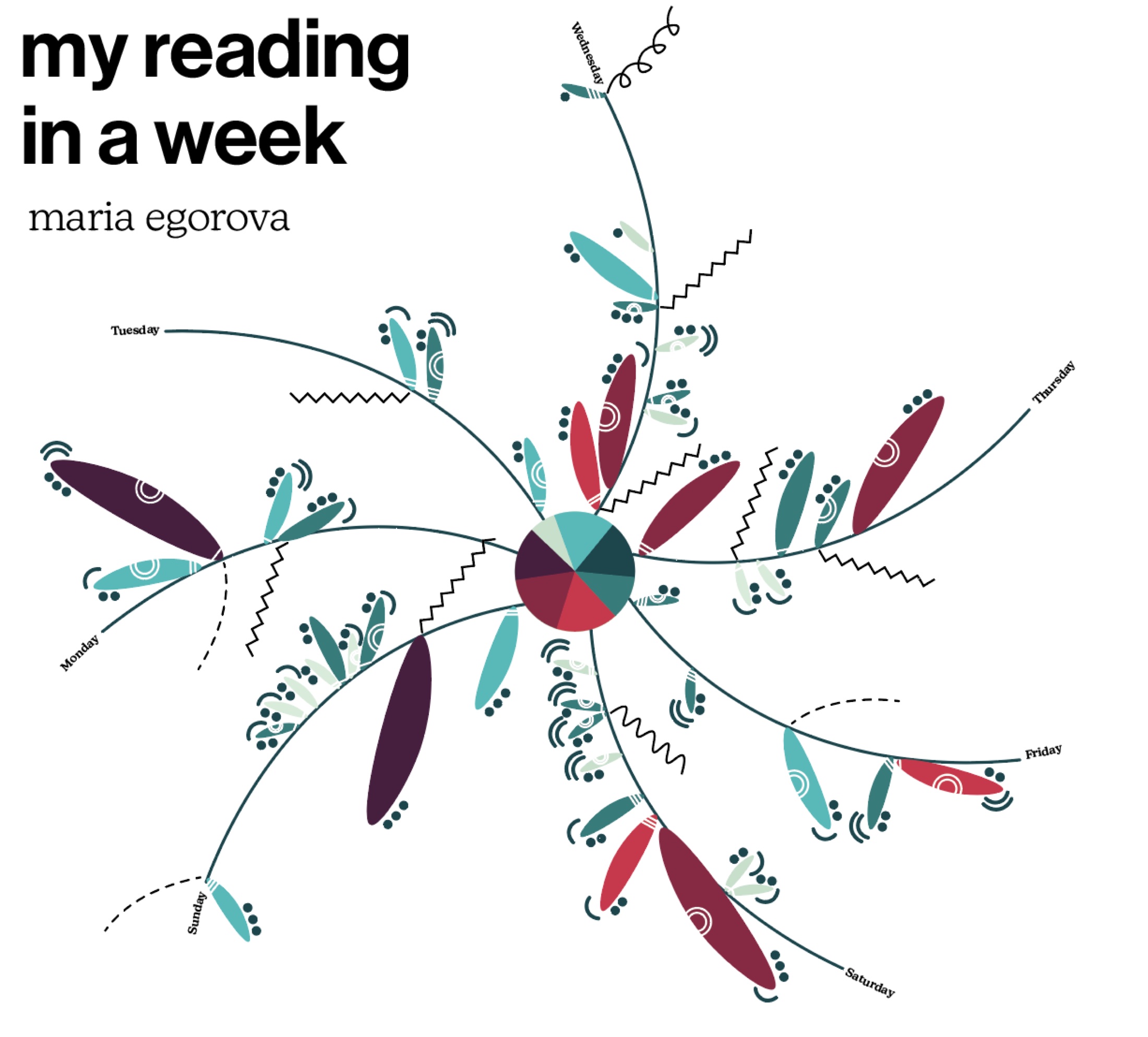
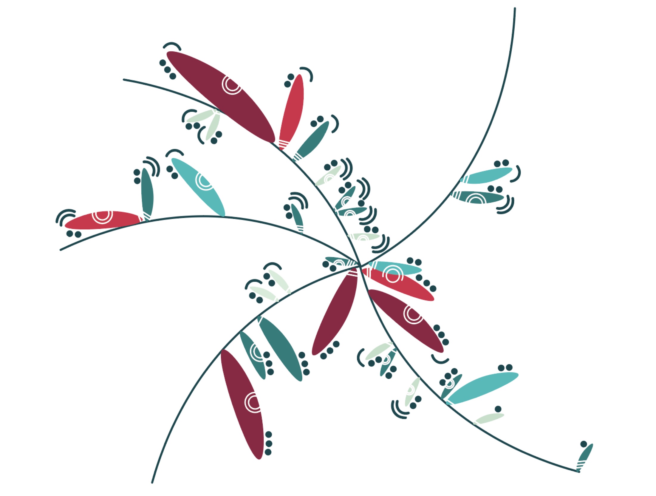
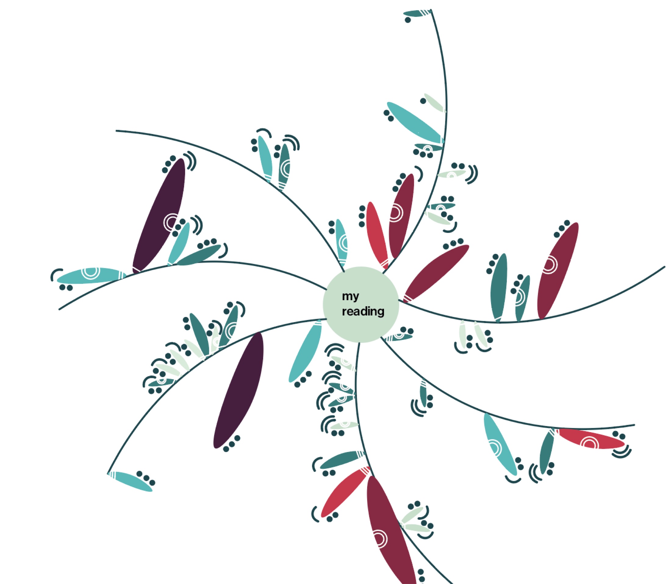
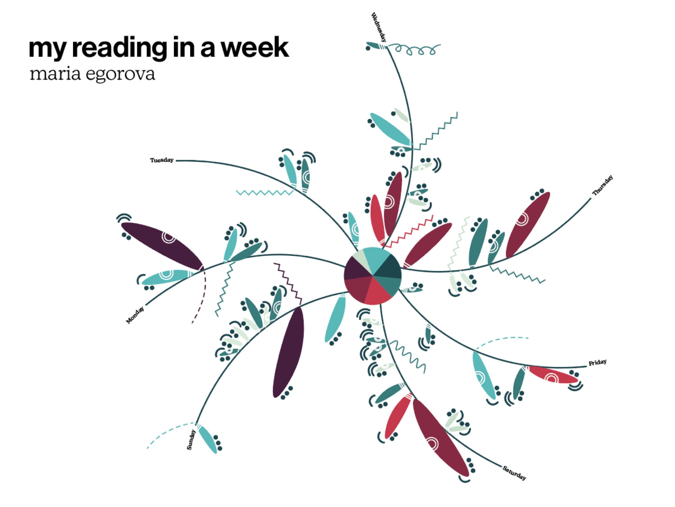
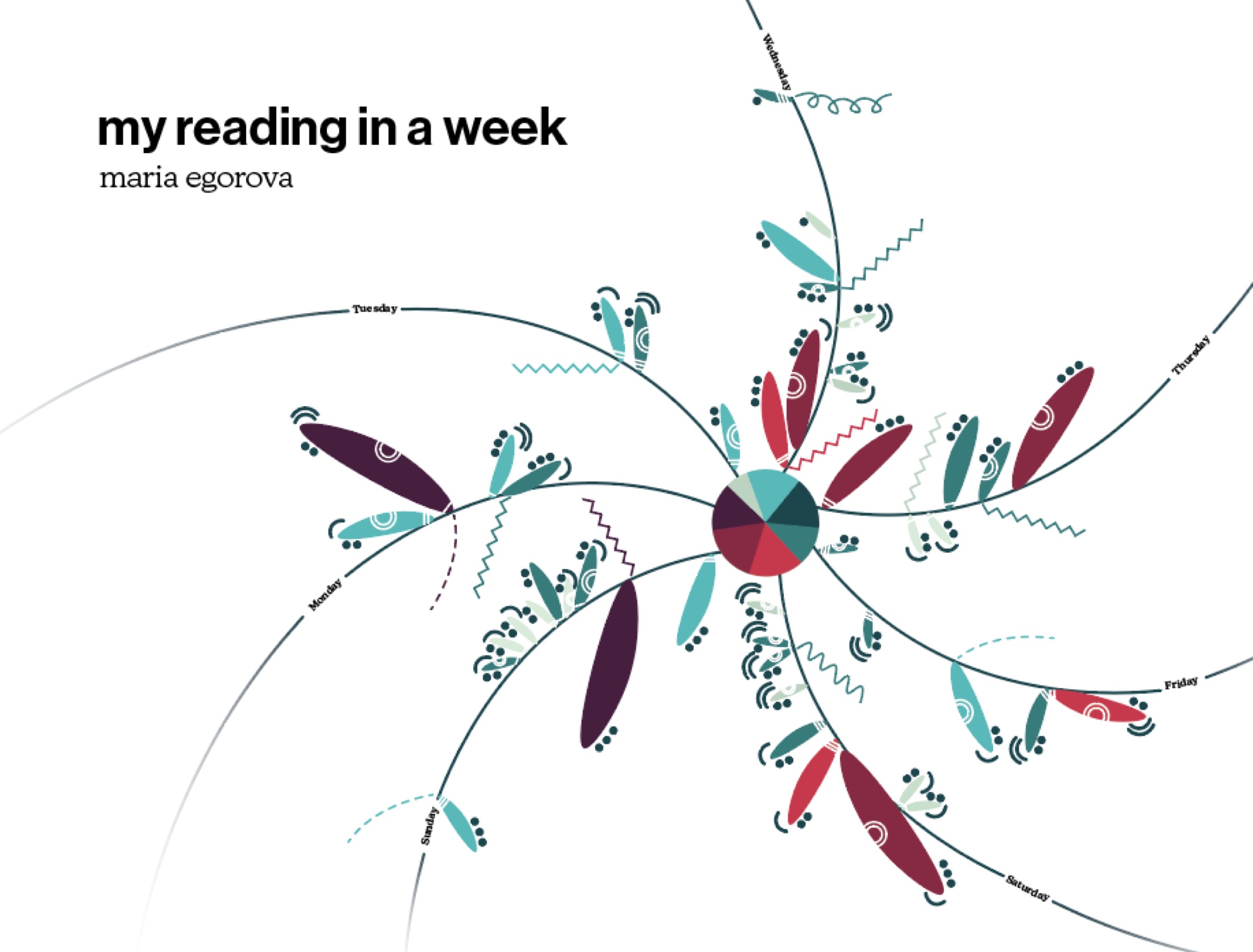
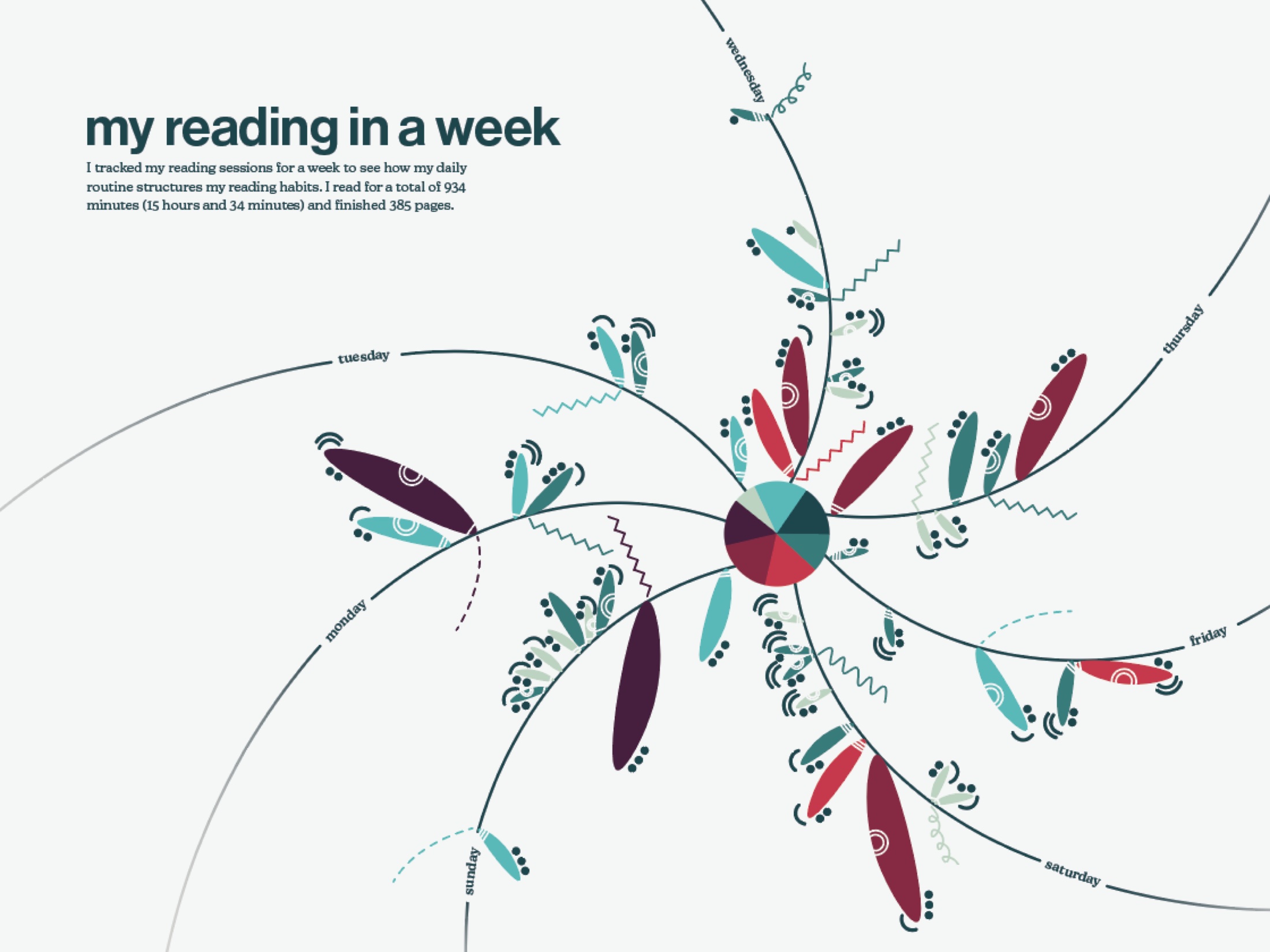
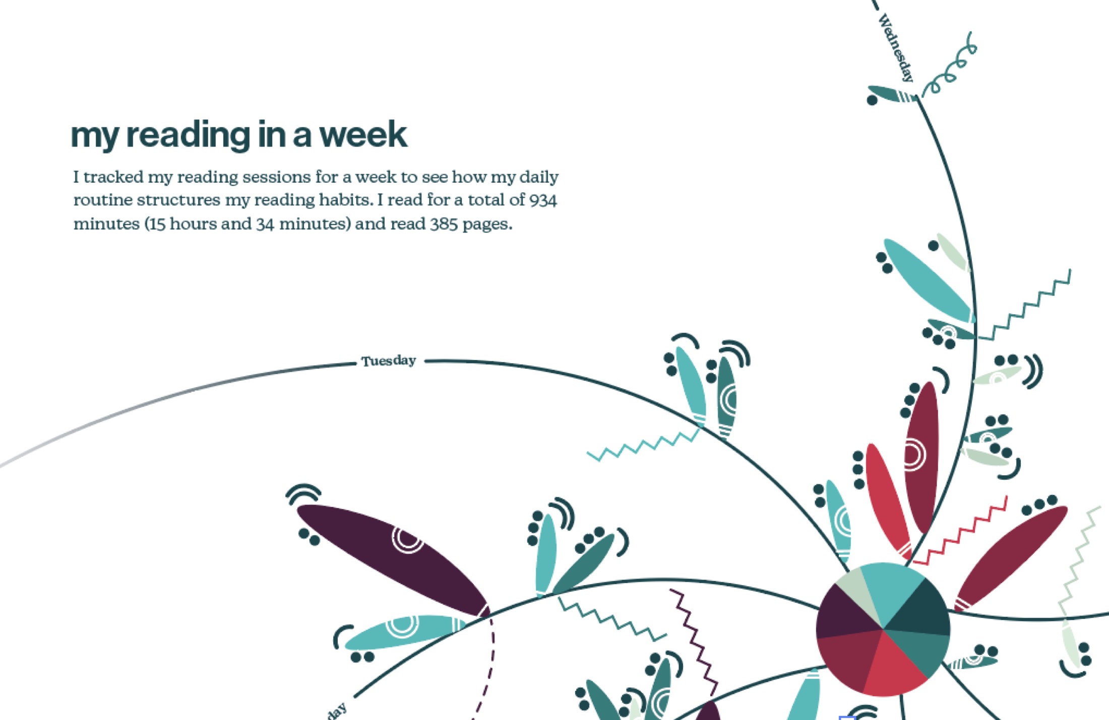
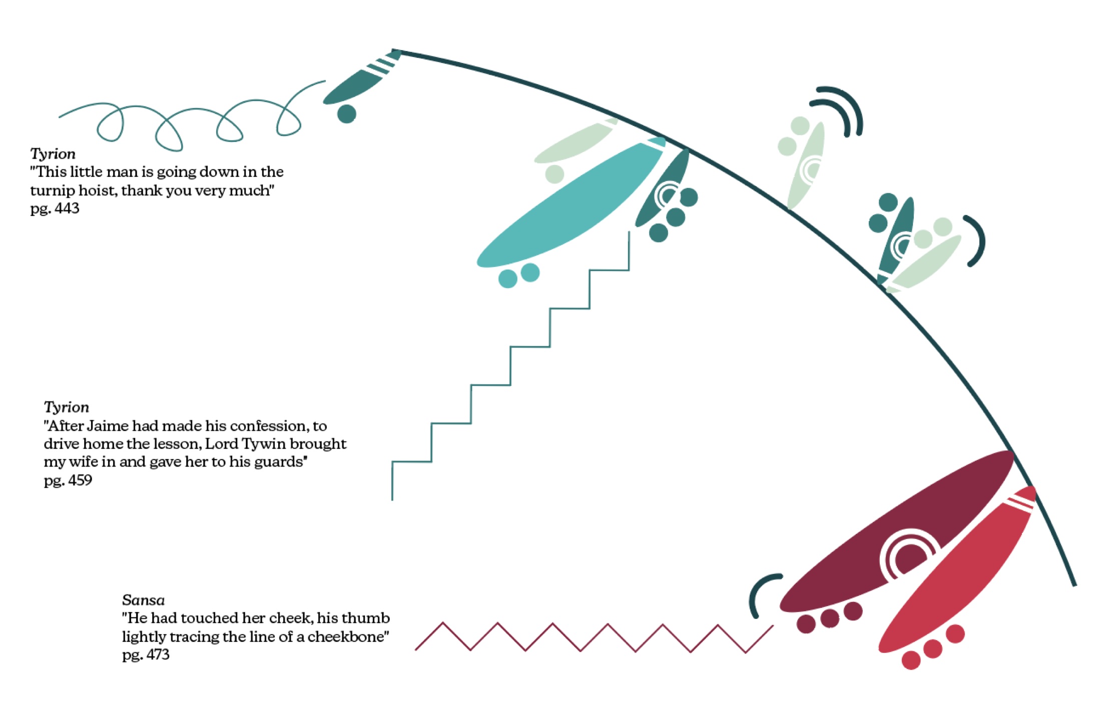
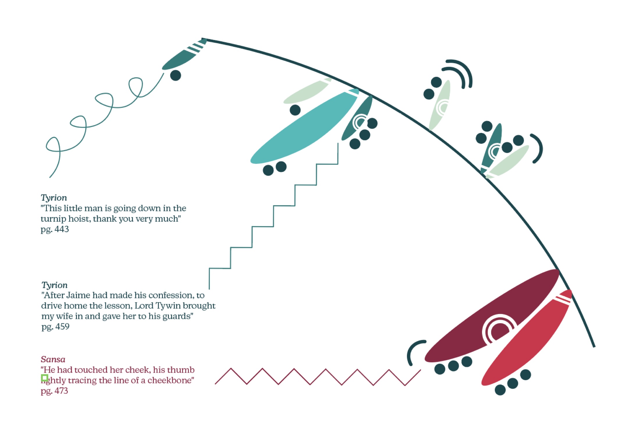
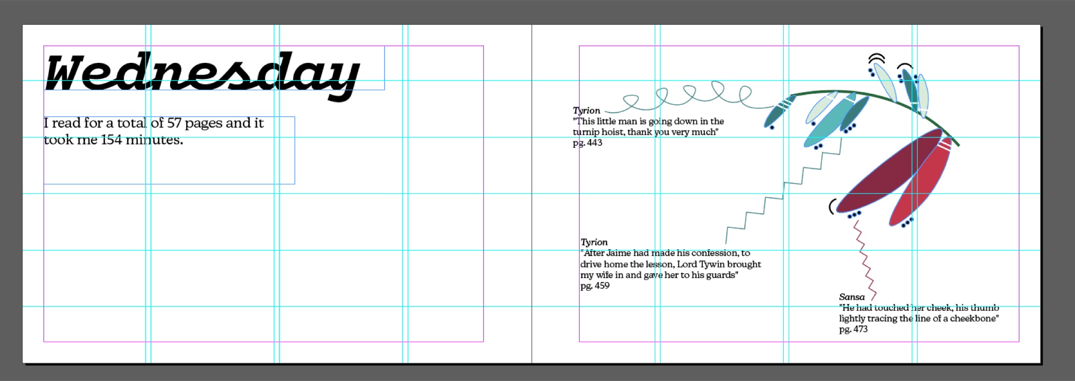
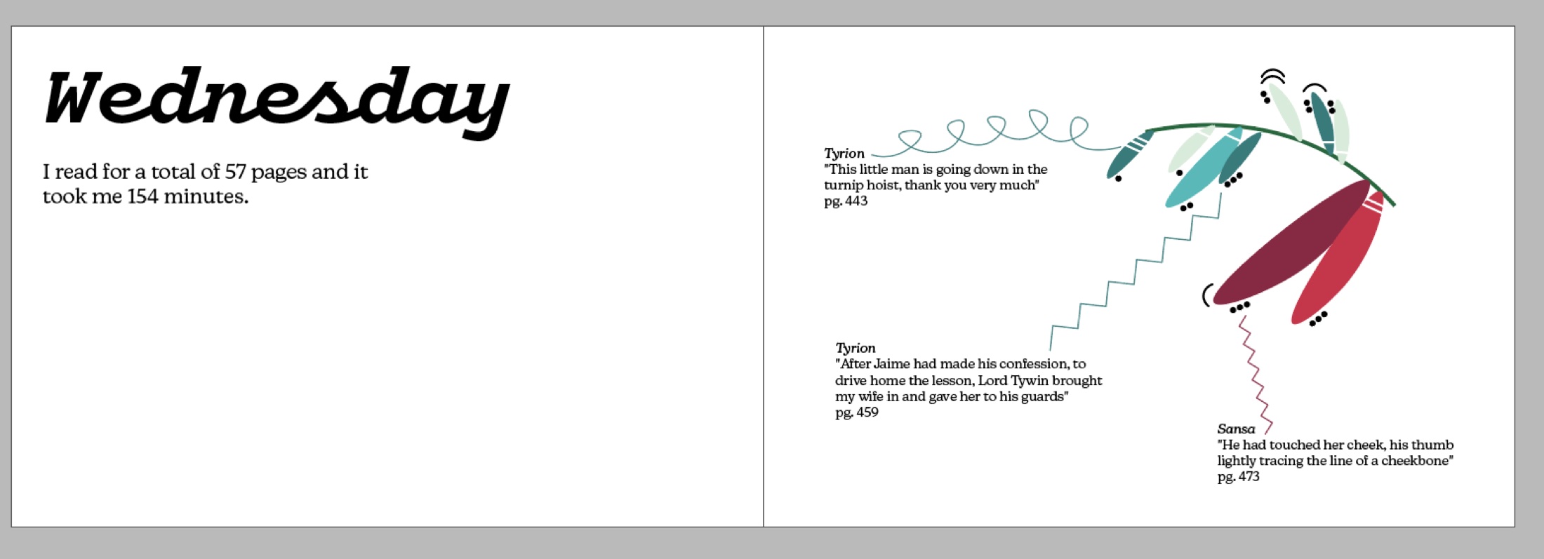
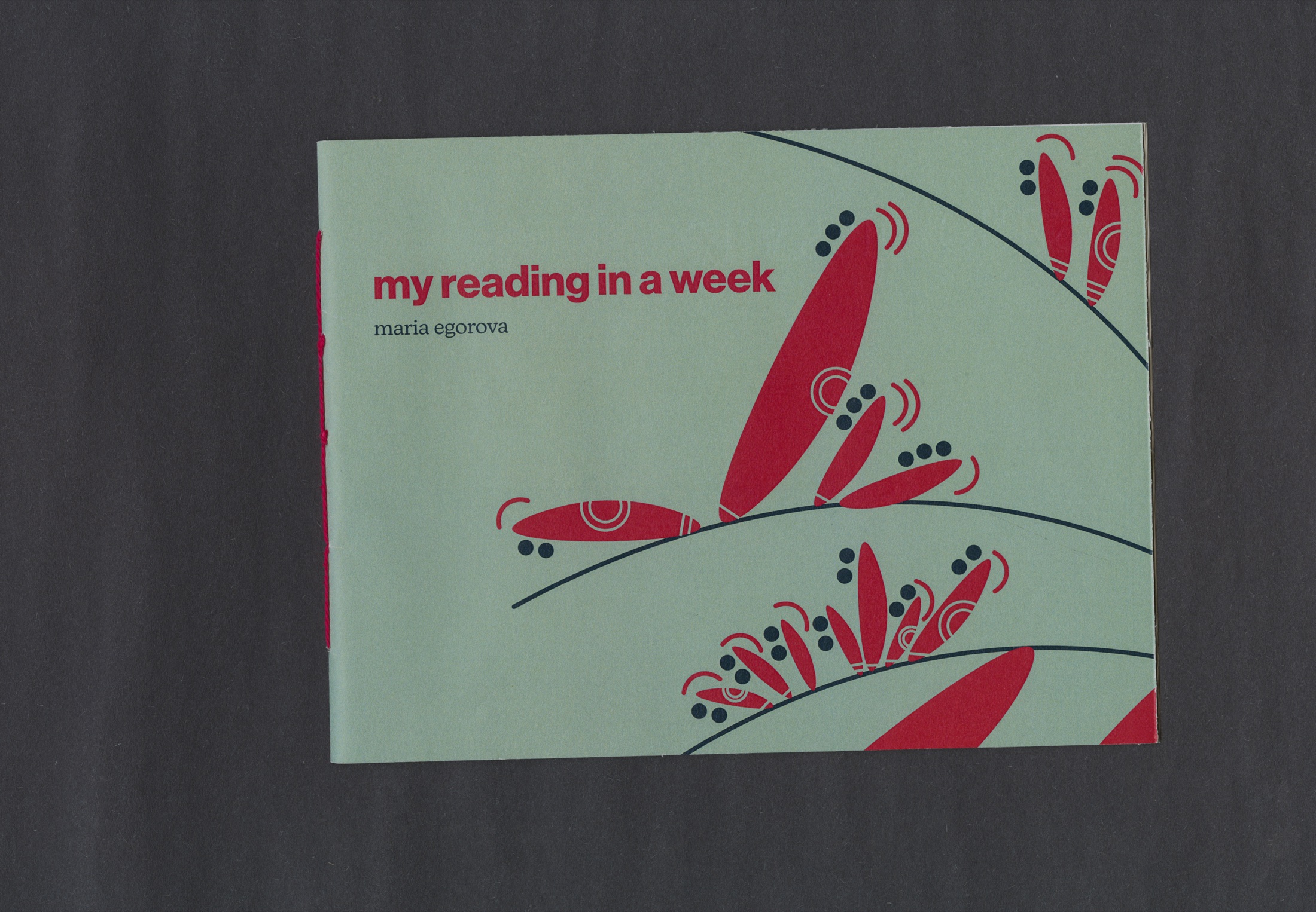
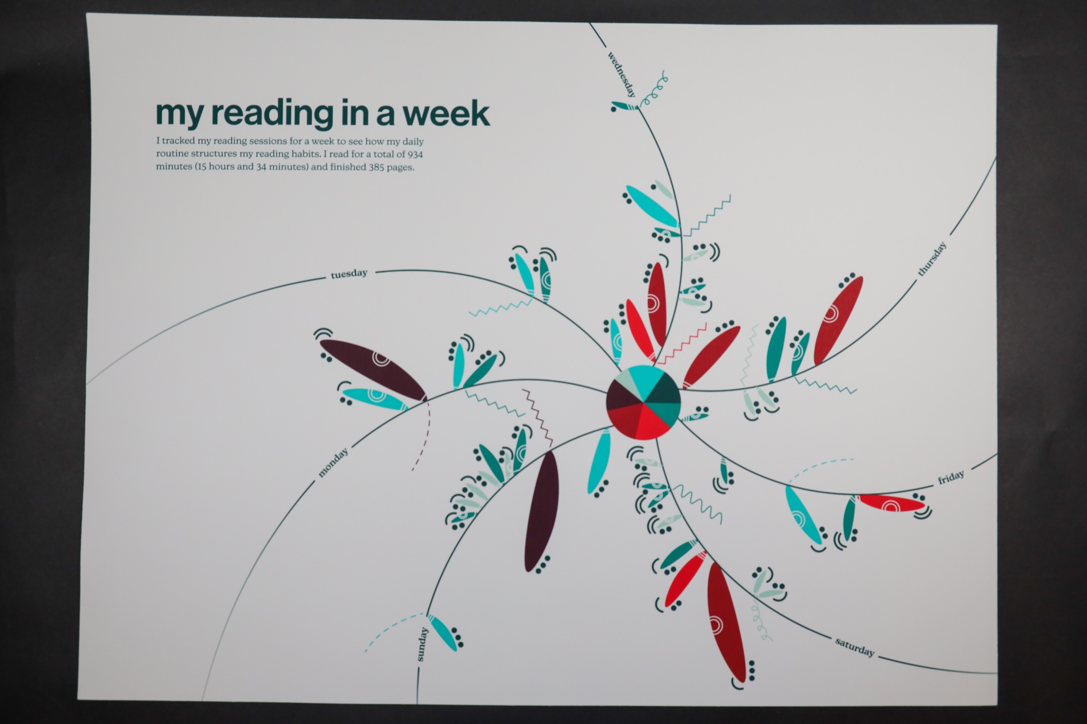
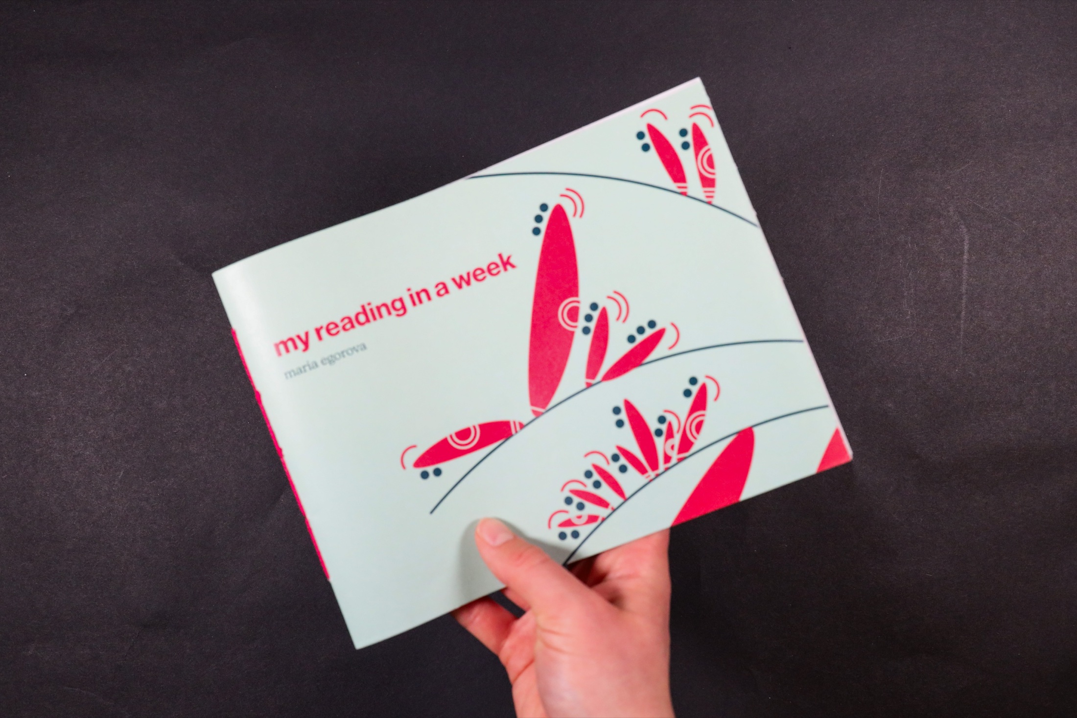
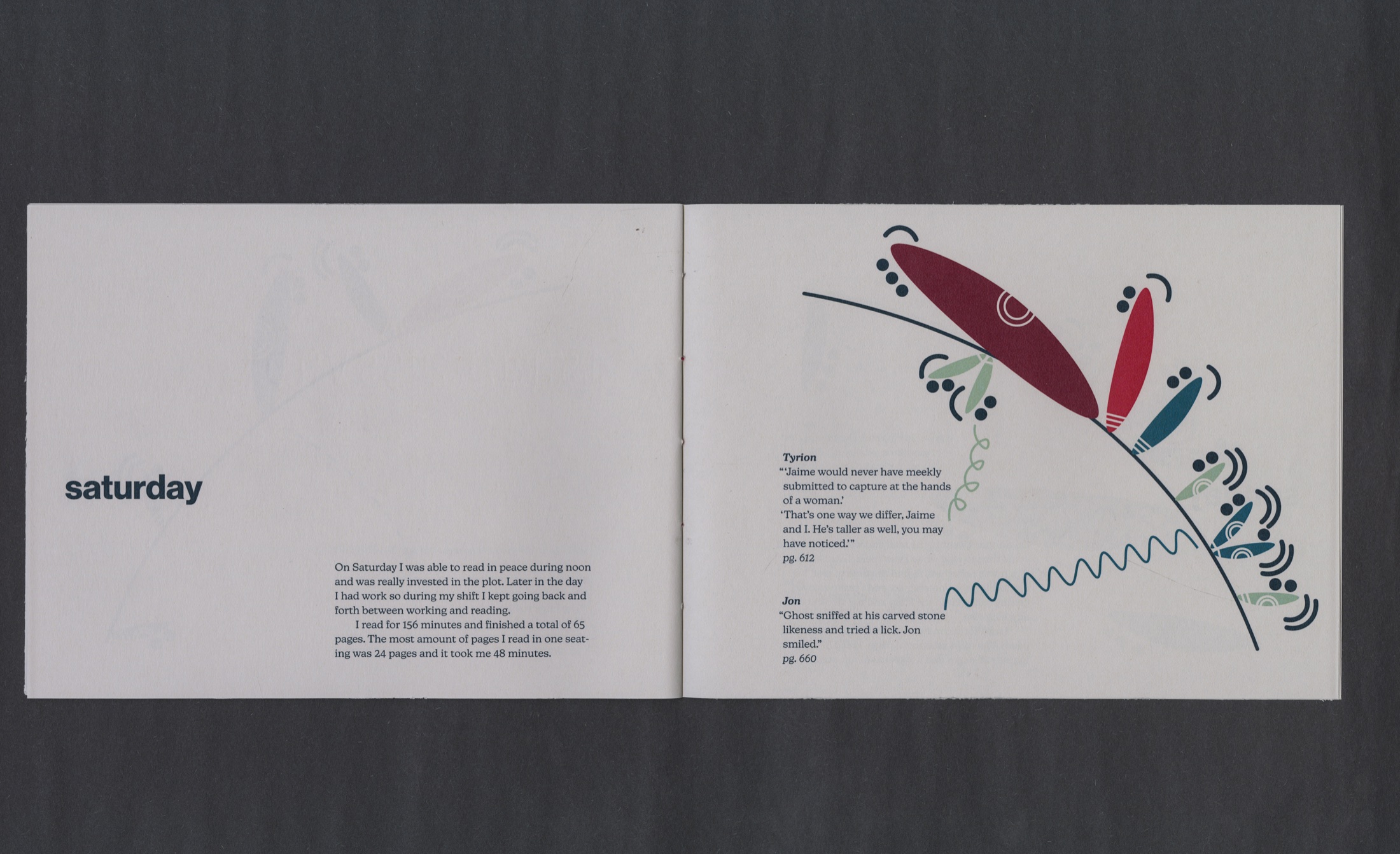
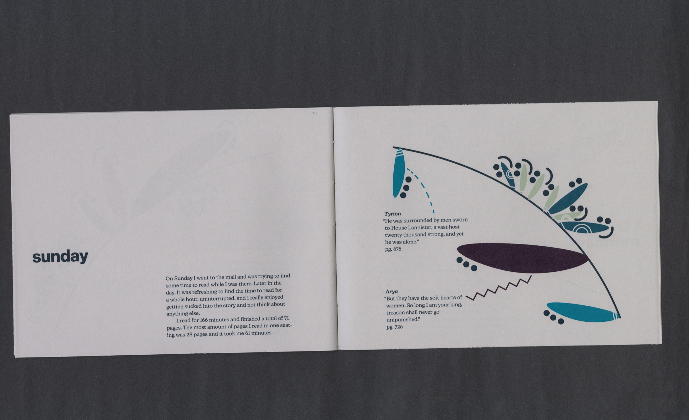
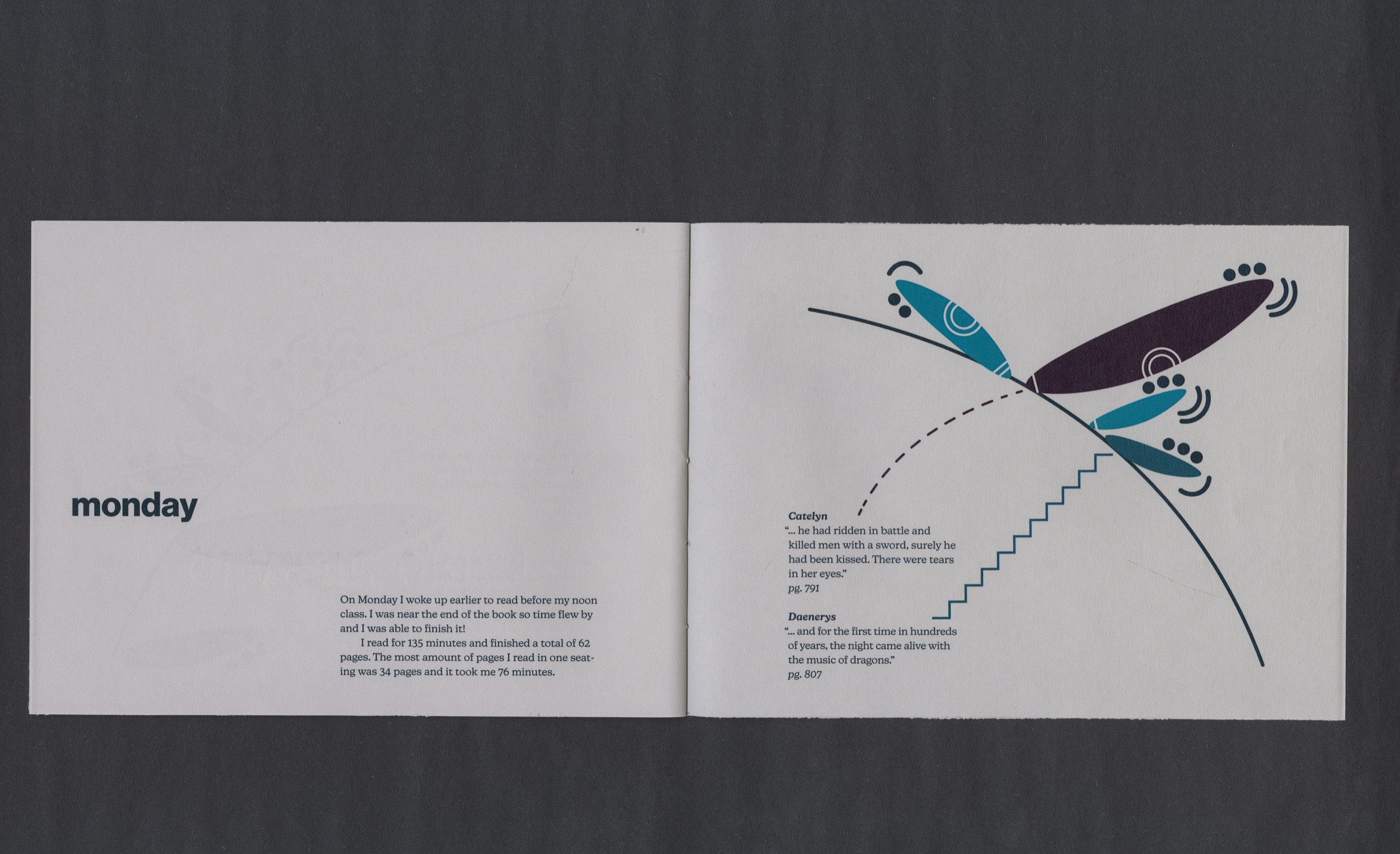
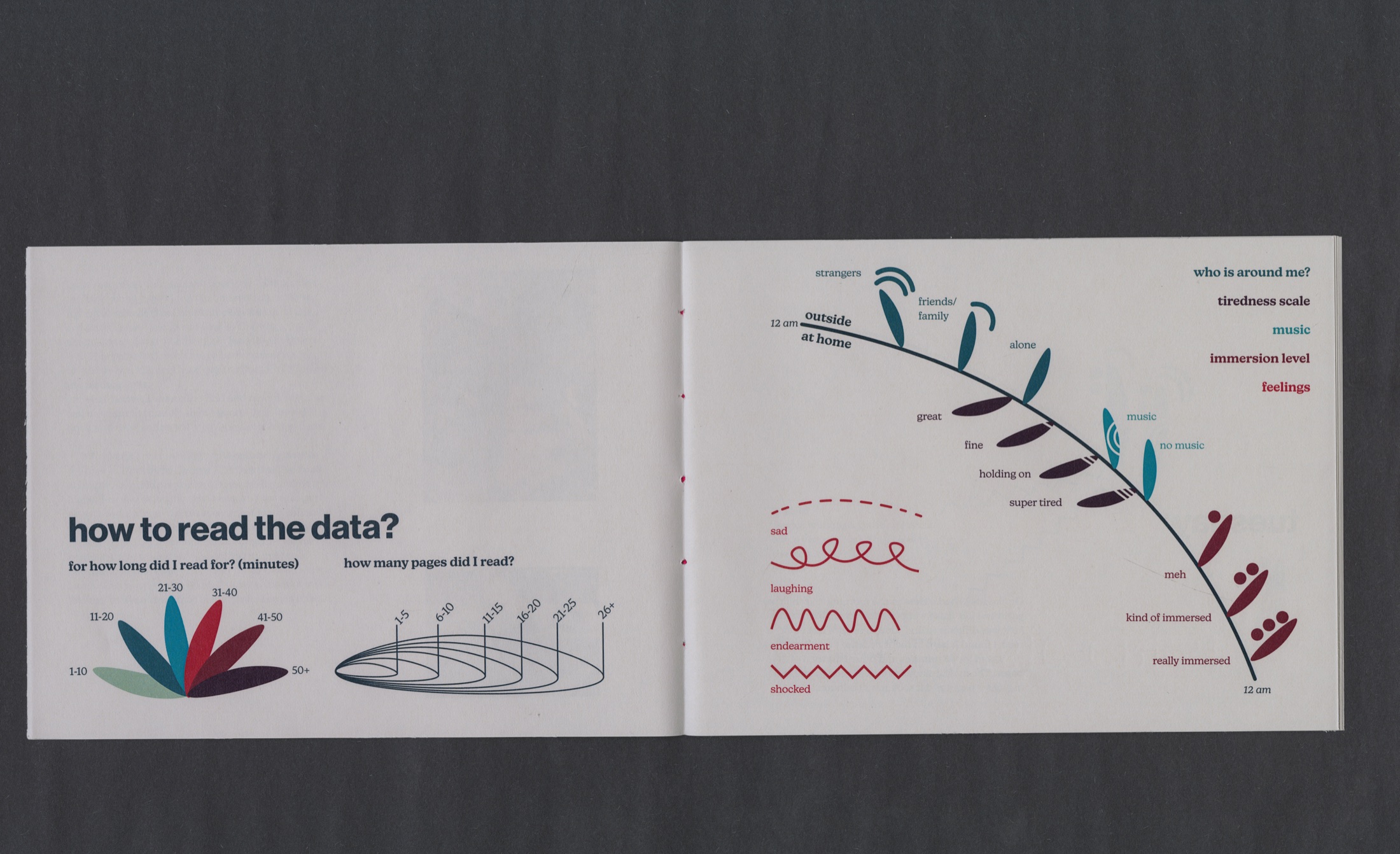
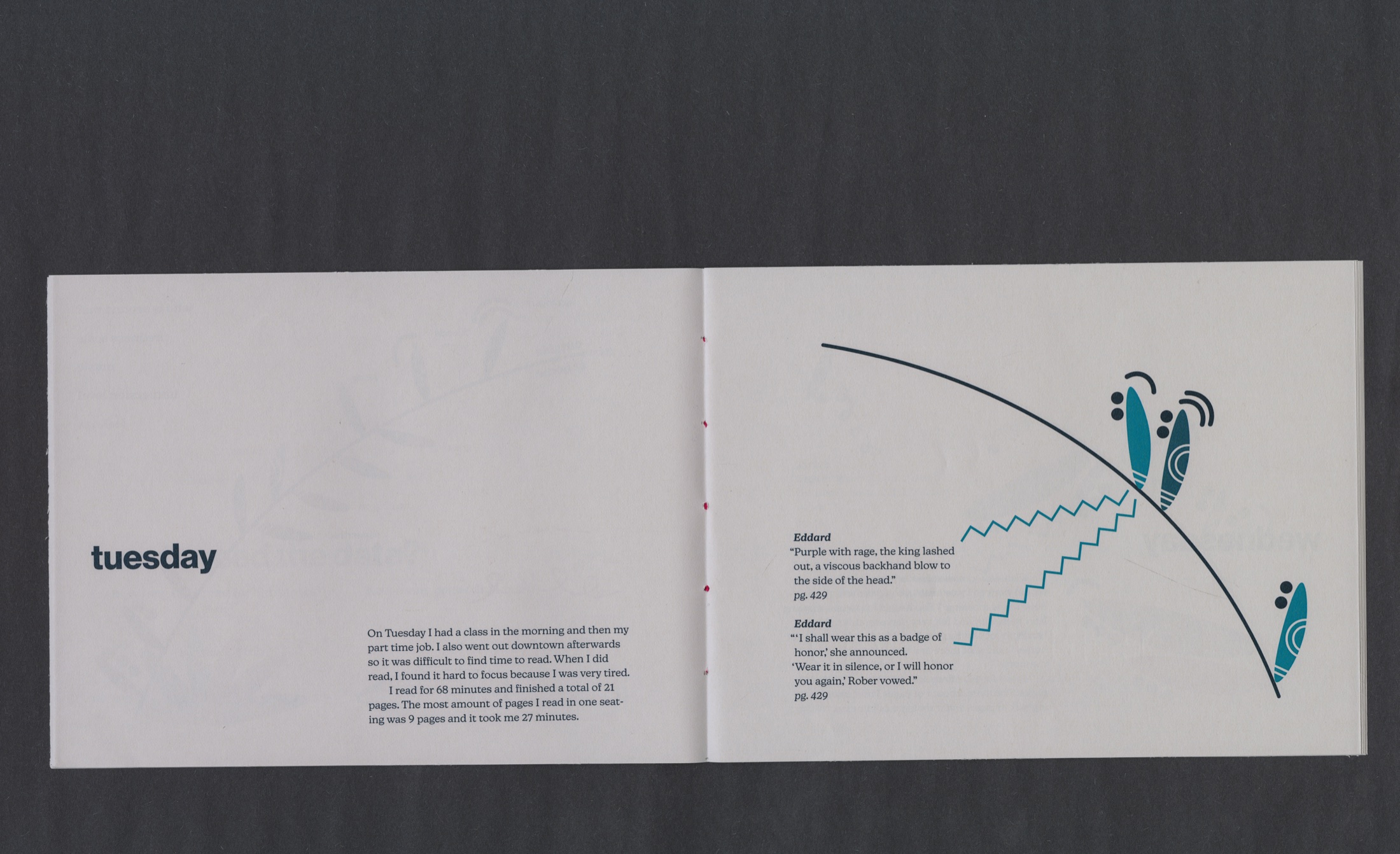
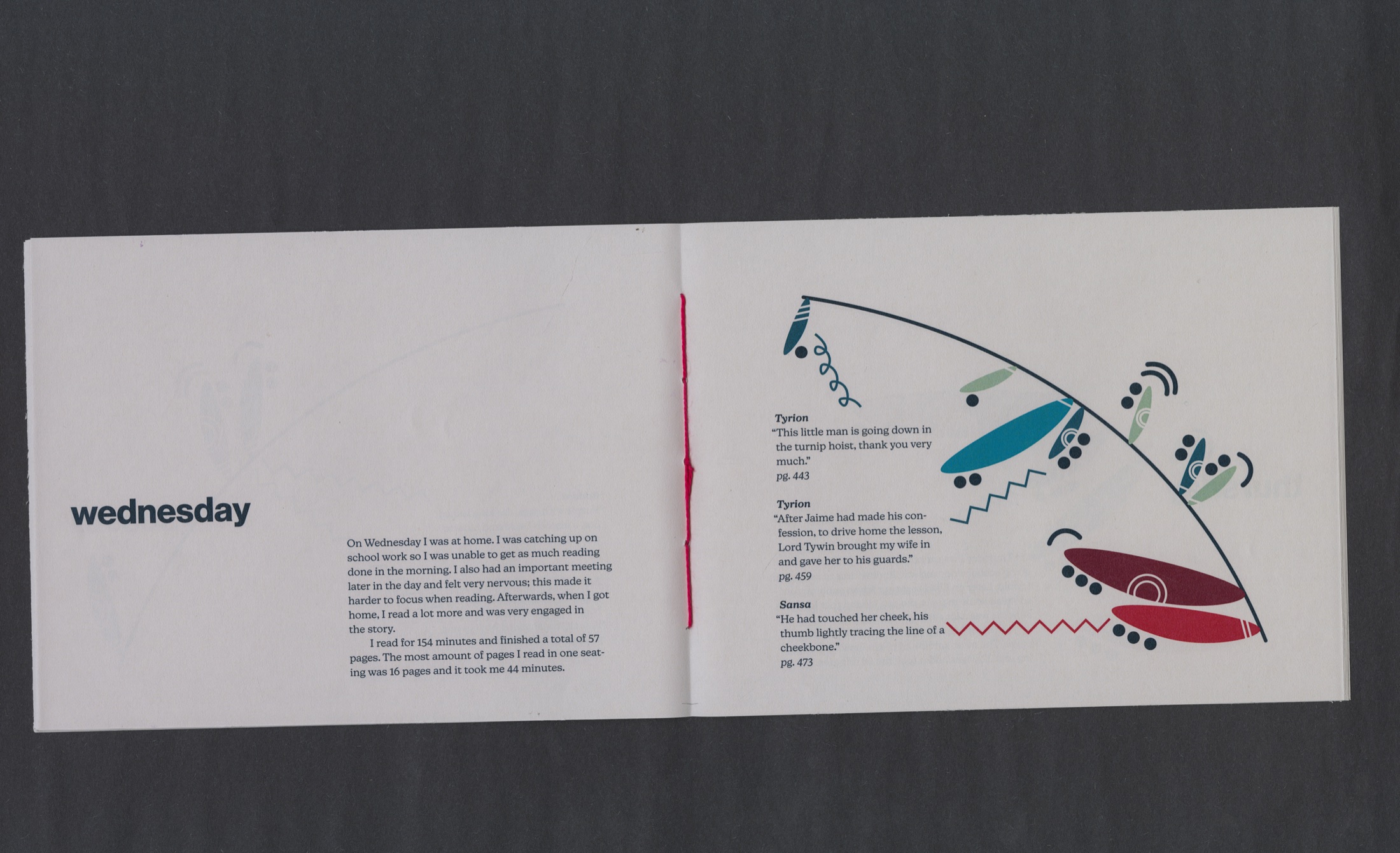
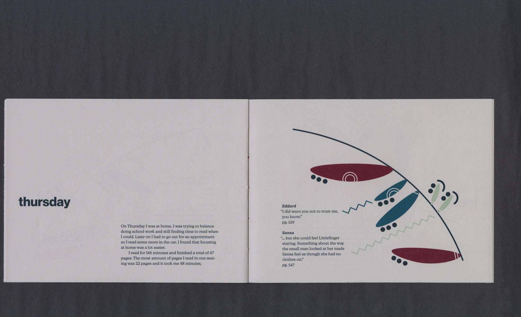
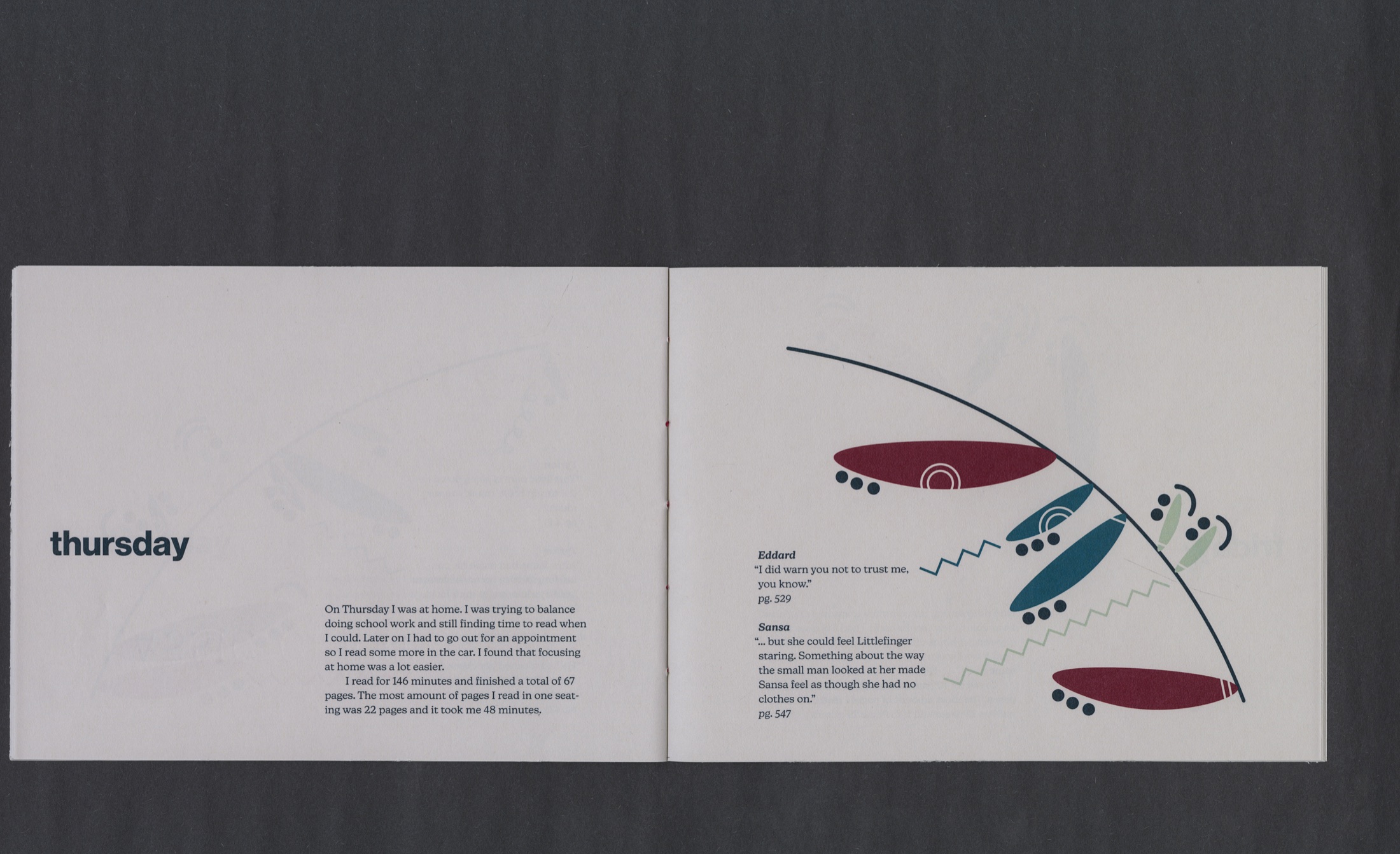
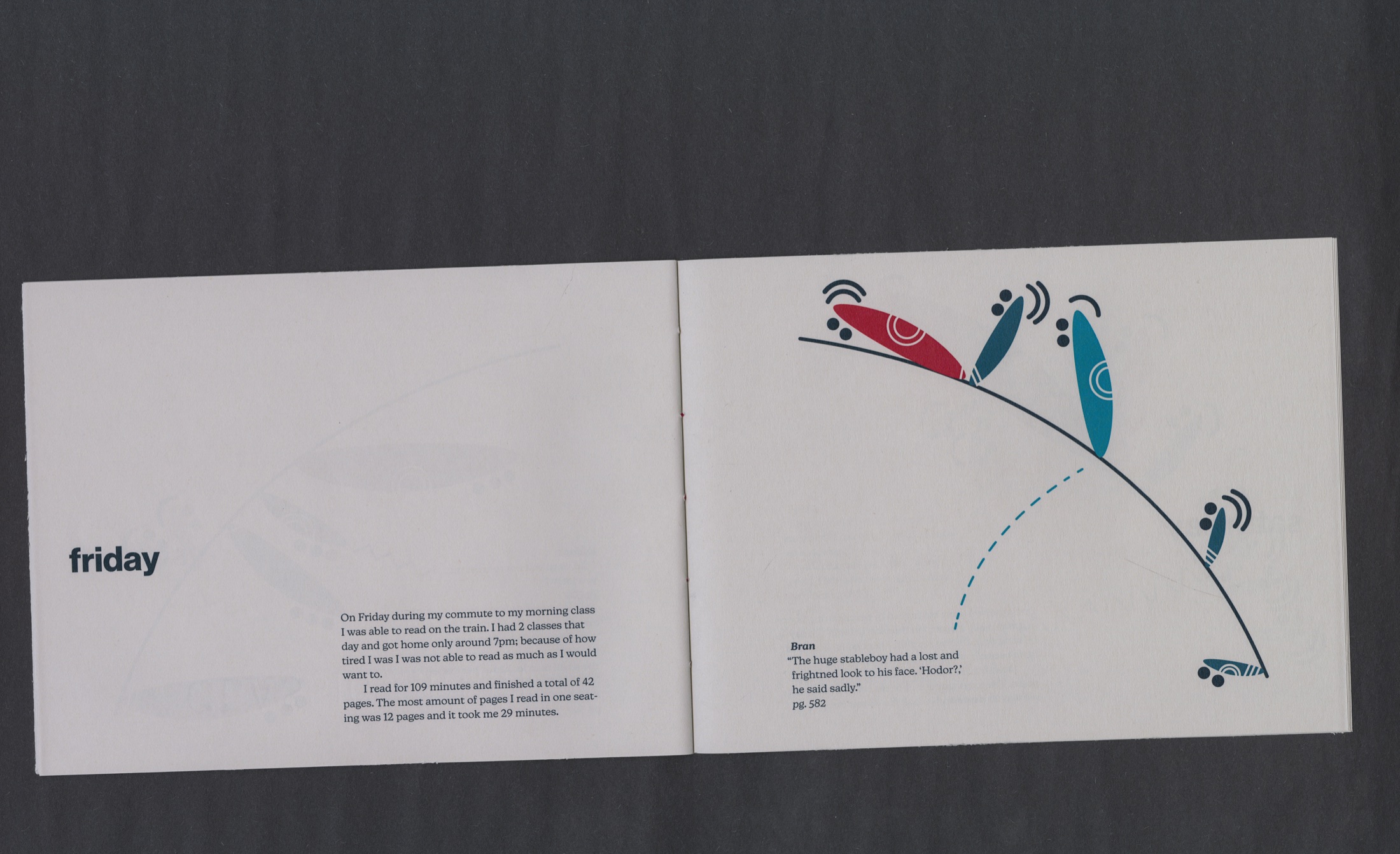
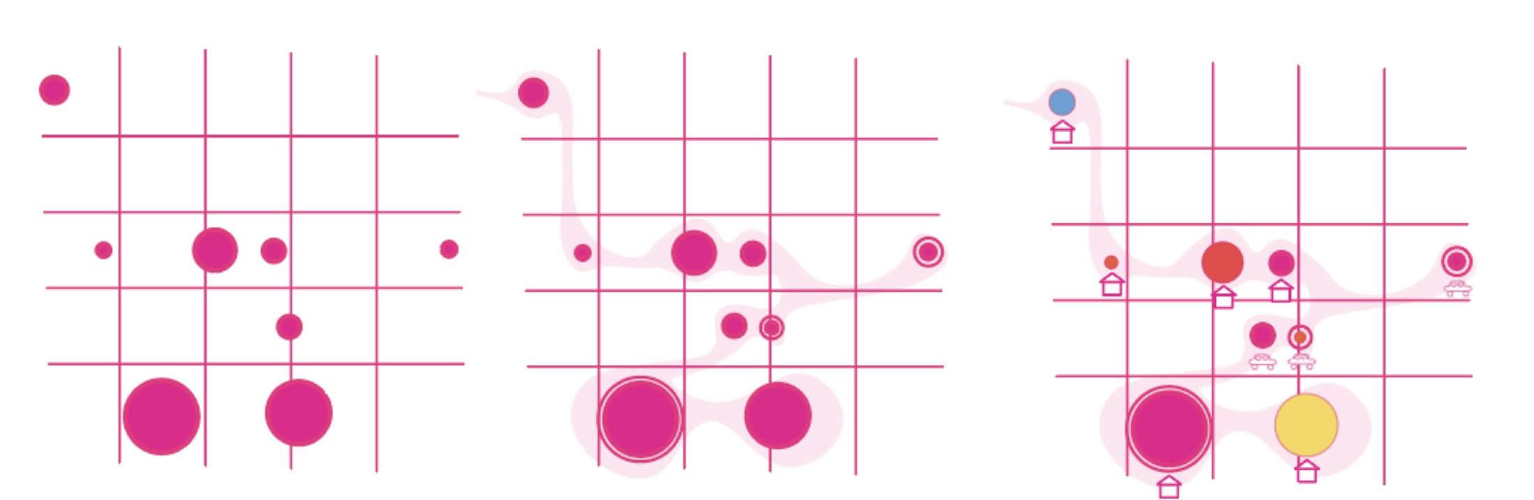
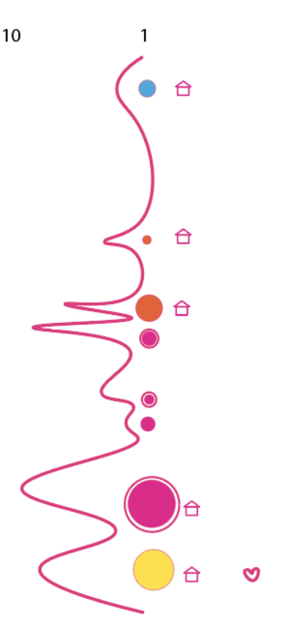
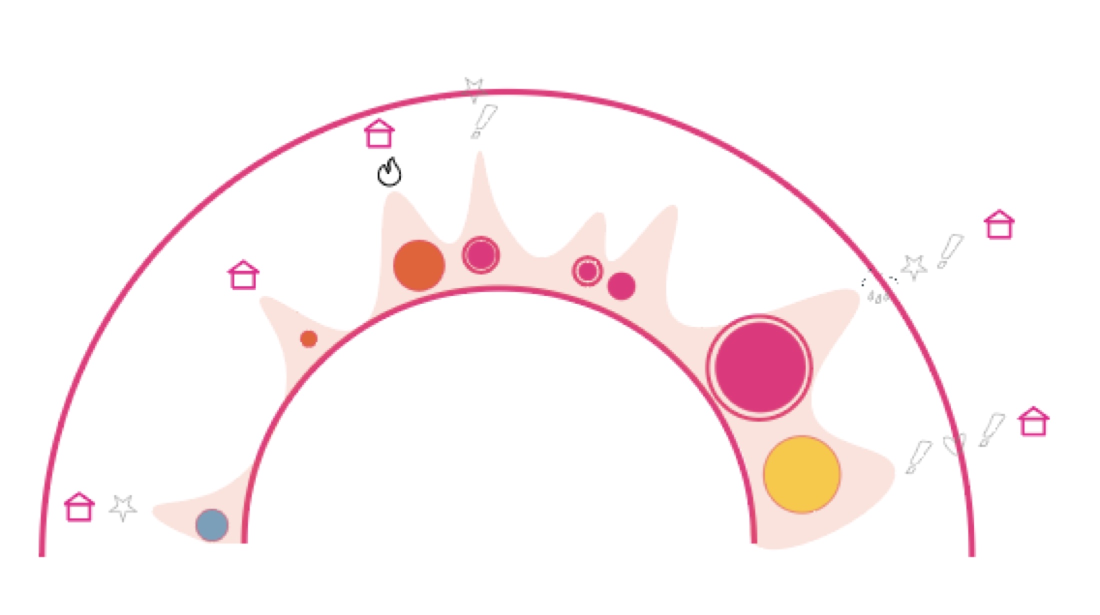
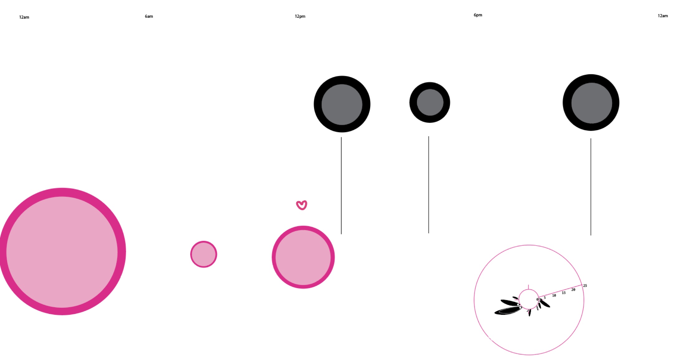
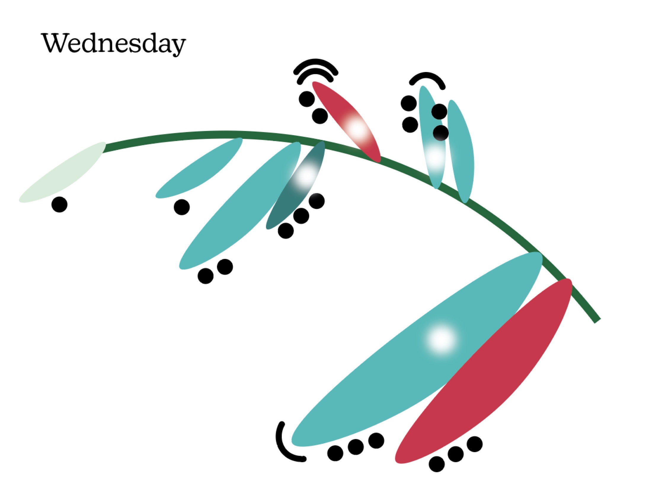
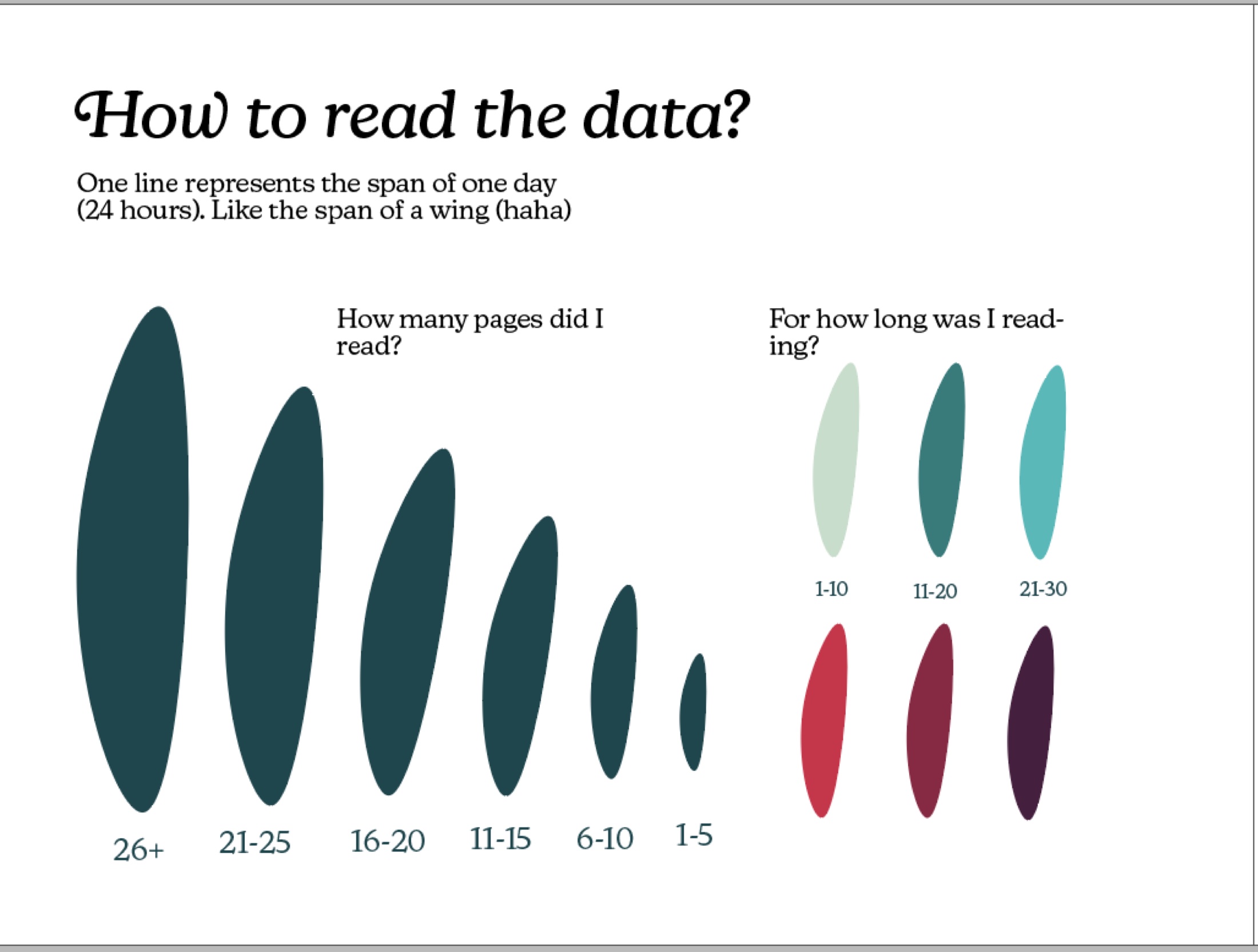
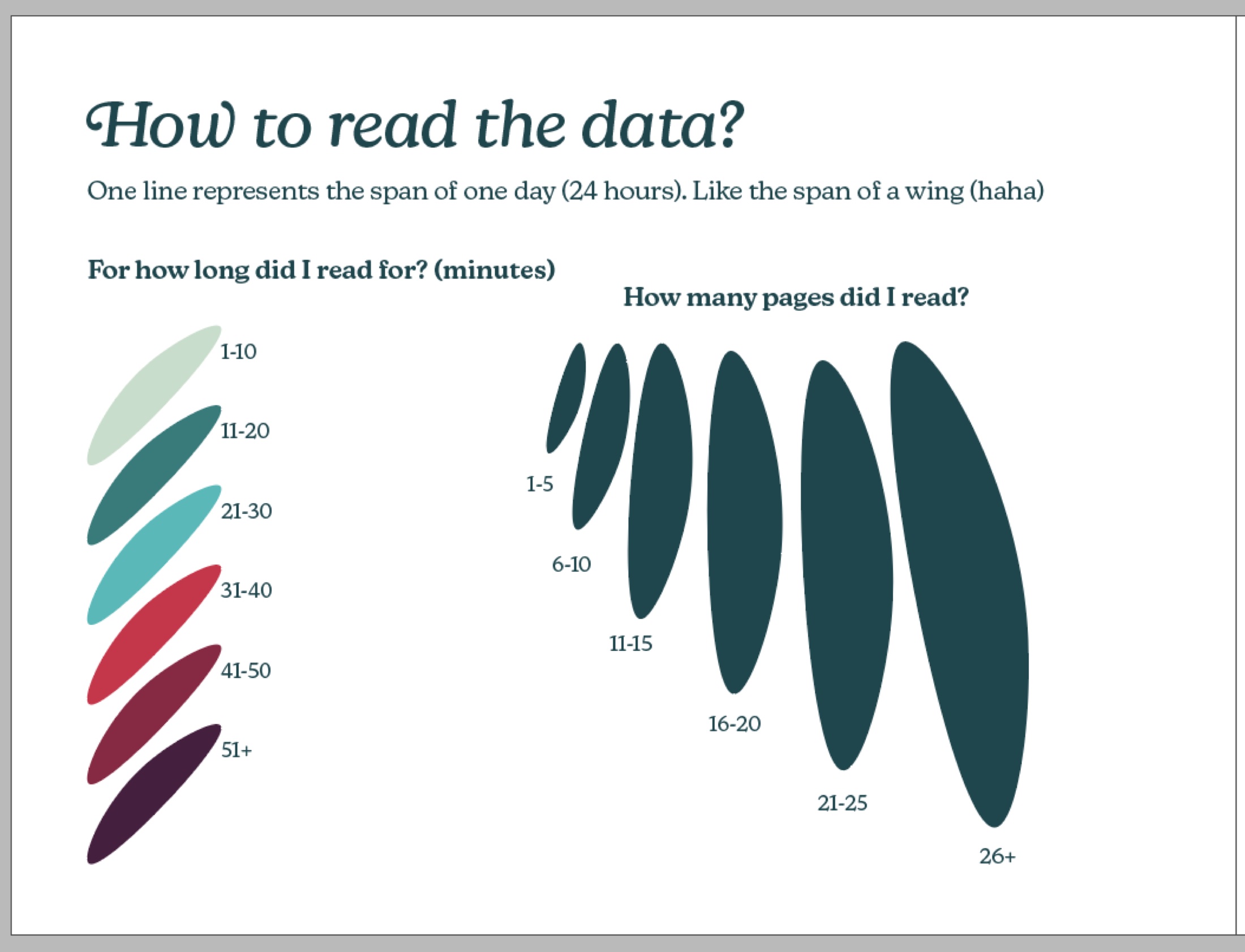
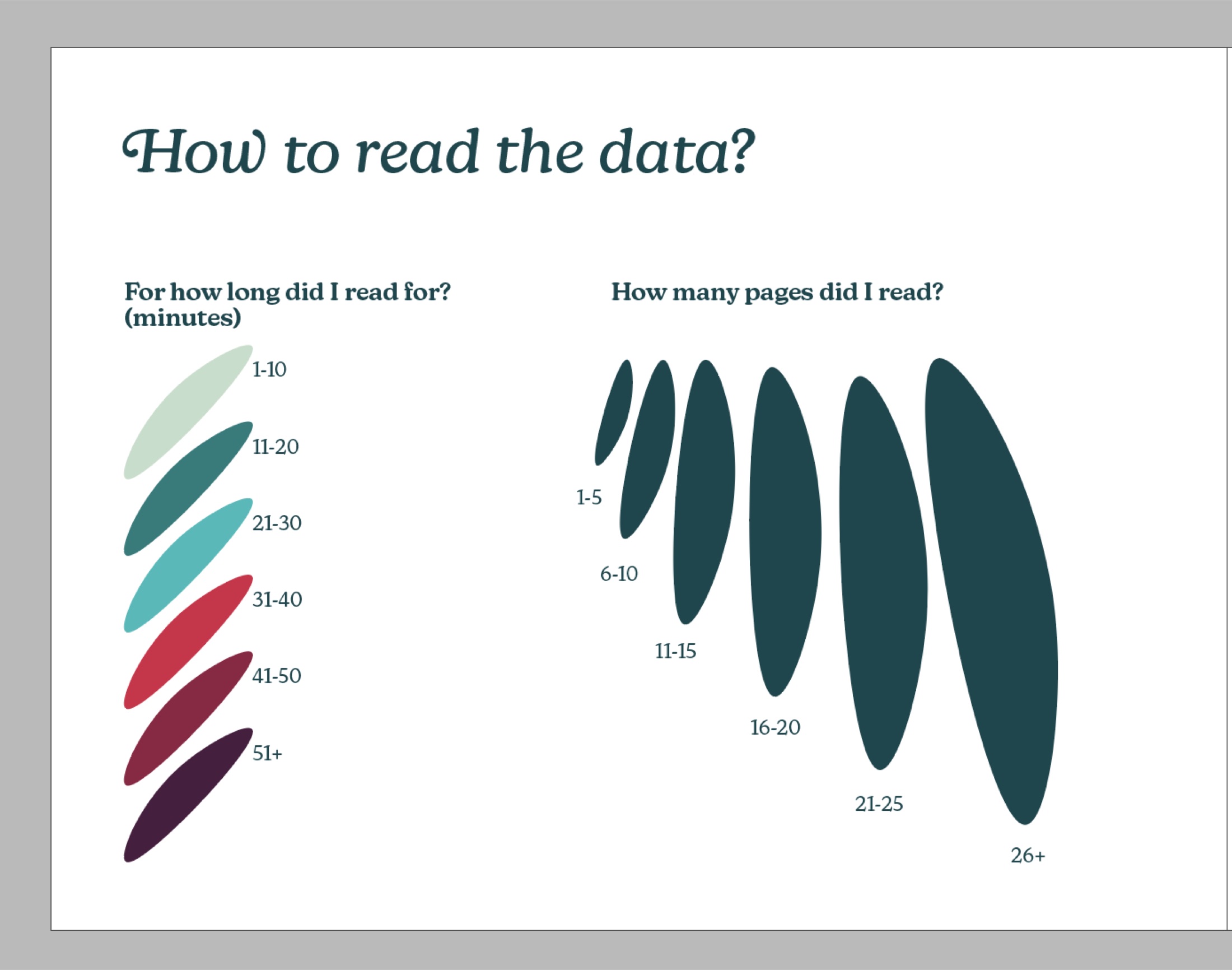
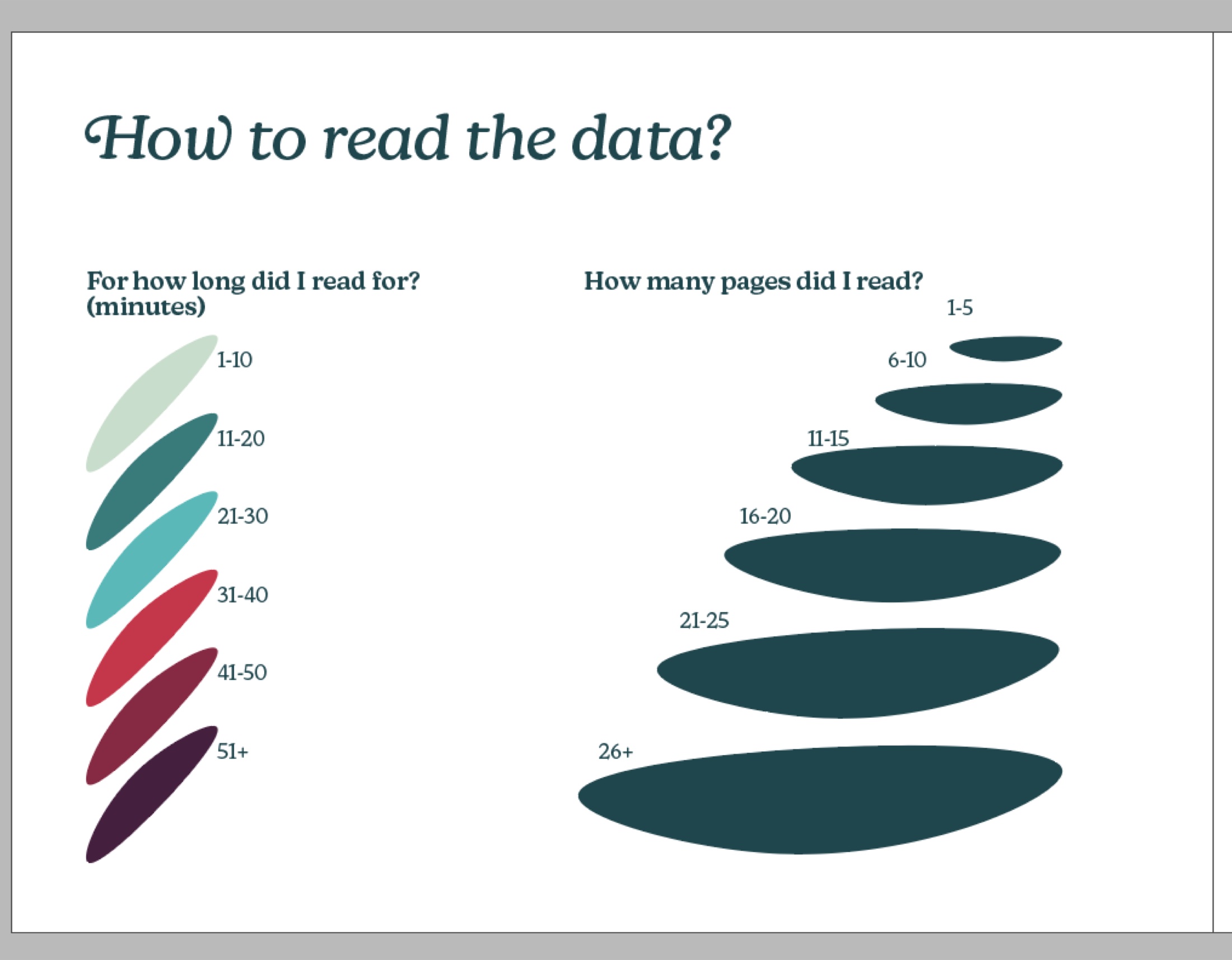
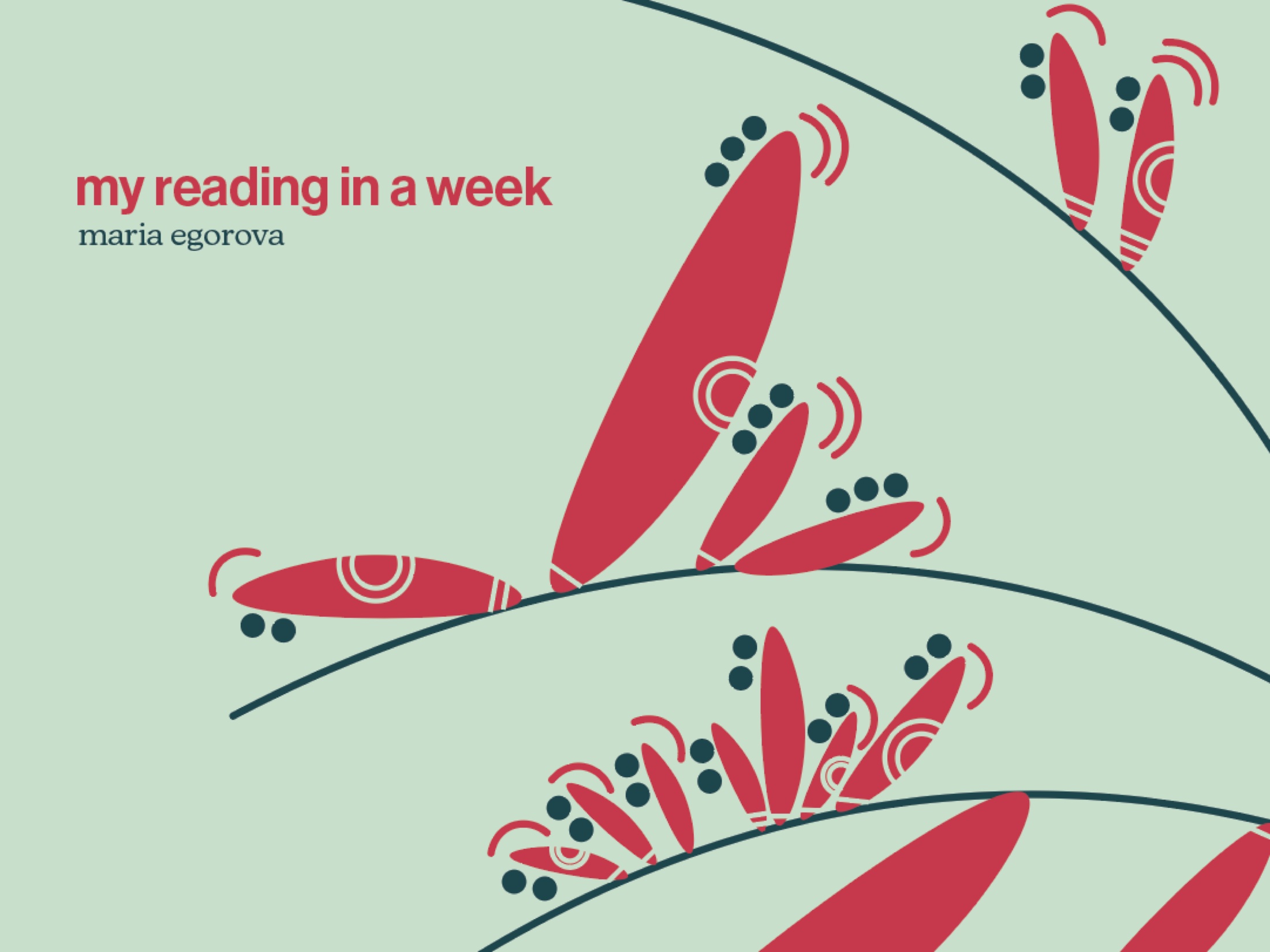
the visual language of this project is defined by very simple, modern, and clean-looking elements. the project prioritizes expressive and abstract visualization of the reading data i gathered, using abstract elements such as lines and circles to help decode the information. the story of my reading habits is encoded in blooming leaves that stem from a main branch, with each leaf representing one reading session. i chose to create a booklet because it supports my theme of reading. i also created a poster as an addition to the booklet to create a more whole experience for viewers.
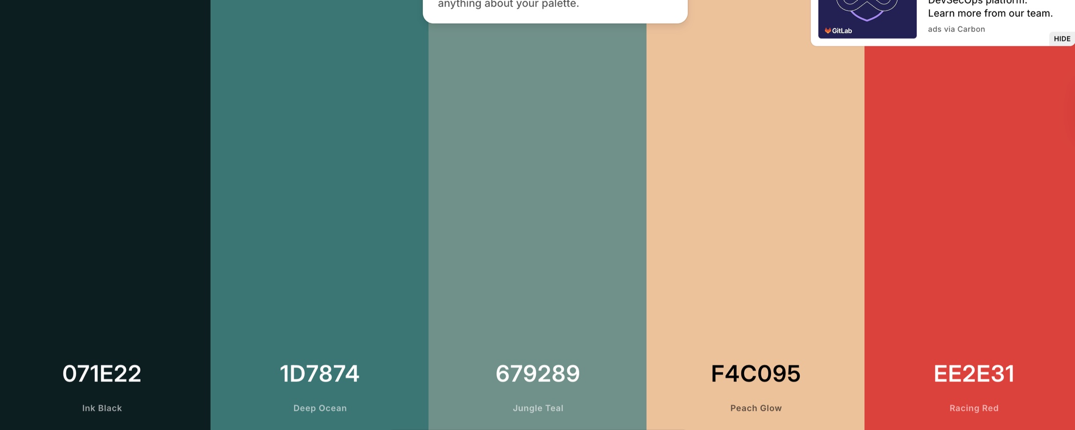
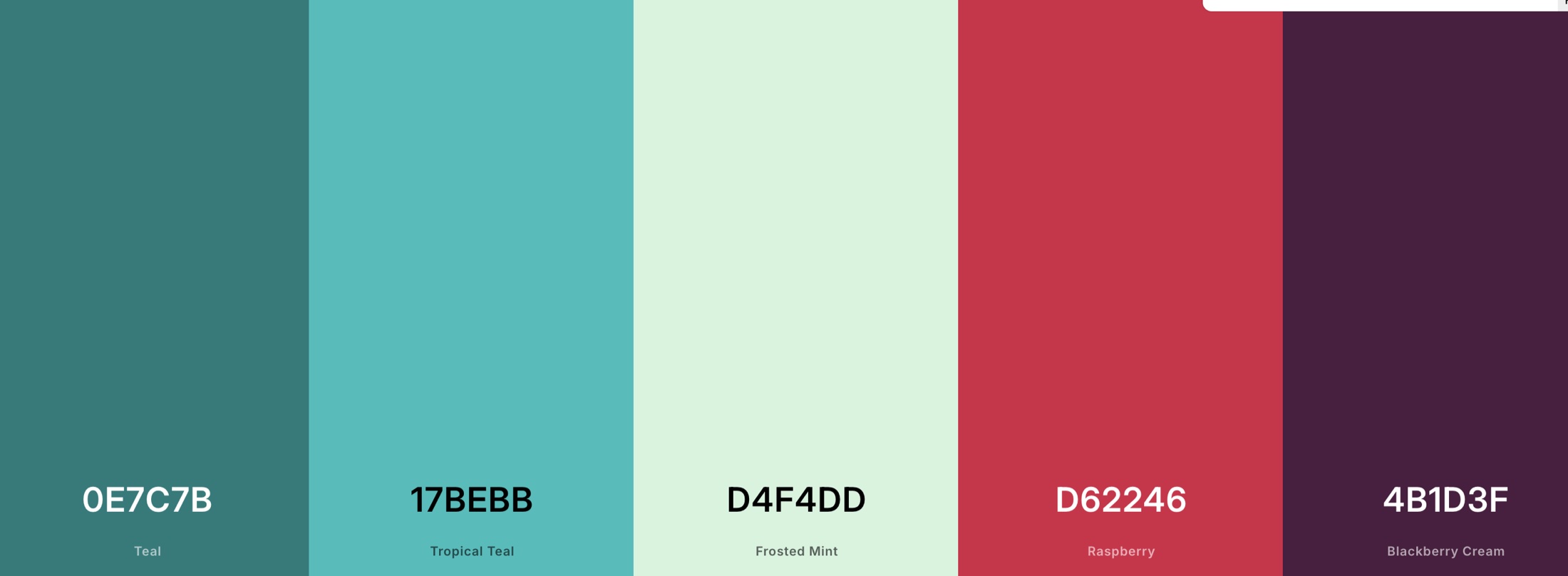
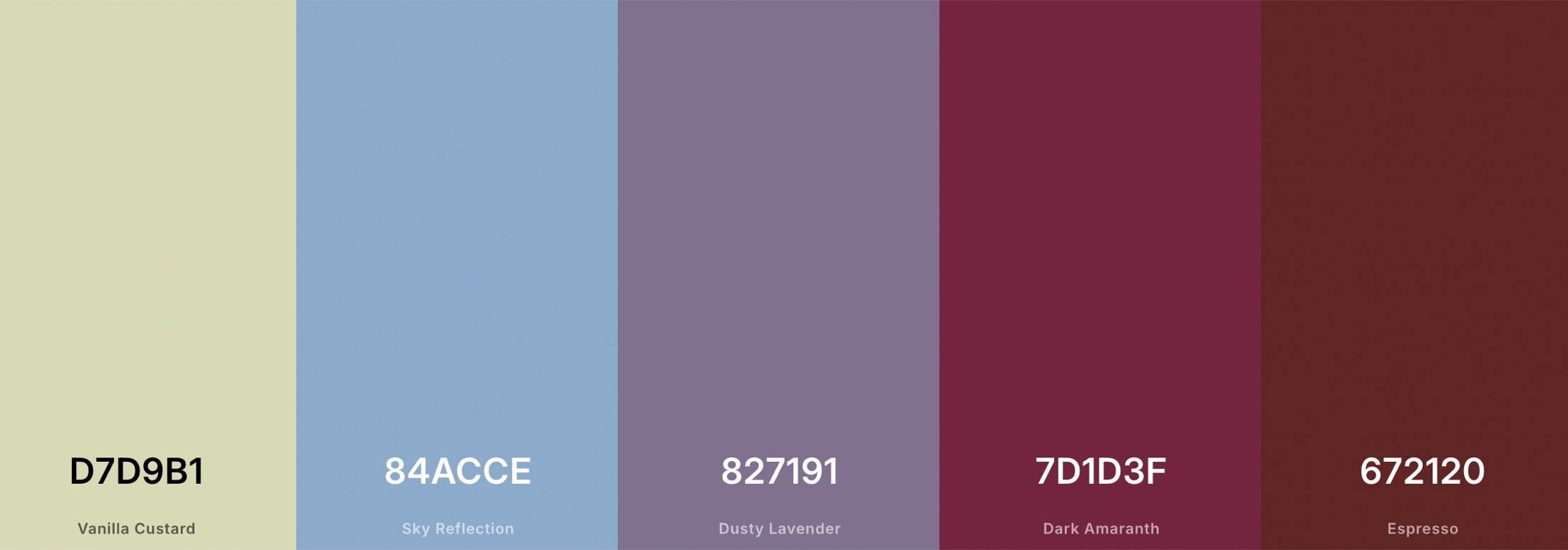
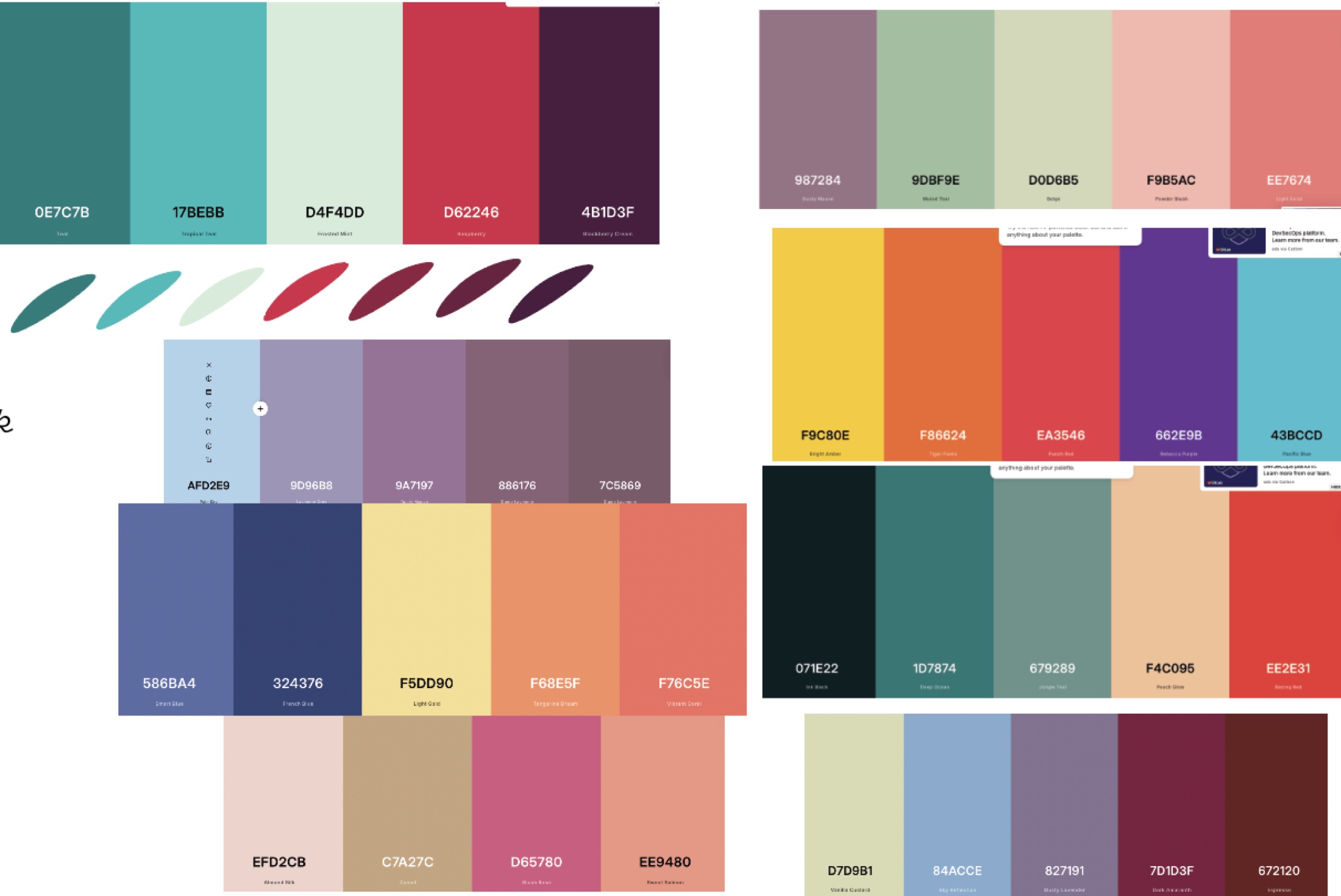
the colour palette of greens and pinks evokes the emotions of nature and greenery, supporting the symbolism of reading as a process of growth and learning. the colours progress from light green to darker maroons to signify increased reading time, mimicking how flowers come to full bloom as they transform from green to red.
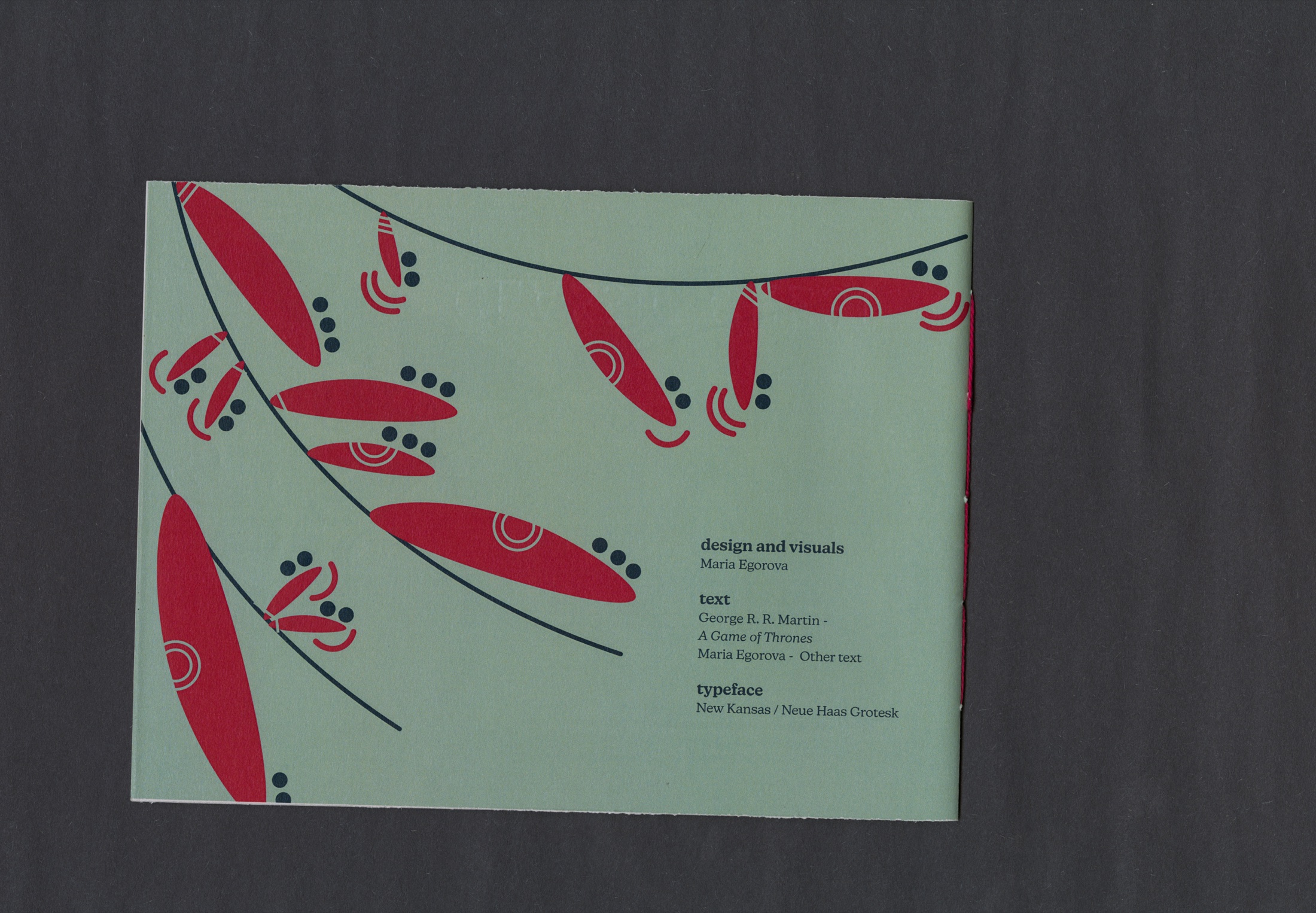
for my typefaces, i am using neue haas grotesk display pro for titles and new kansas for subtitles and body text. i chose to use lowercase for titles to create a smoother reading flow, resulting in a softer, more natural, and clean look.
to bind the booklet, i used a saddle stitch. the threaded binding adds an additional personal touch and reinforces the sense of a handcrafted, individualized experience.
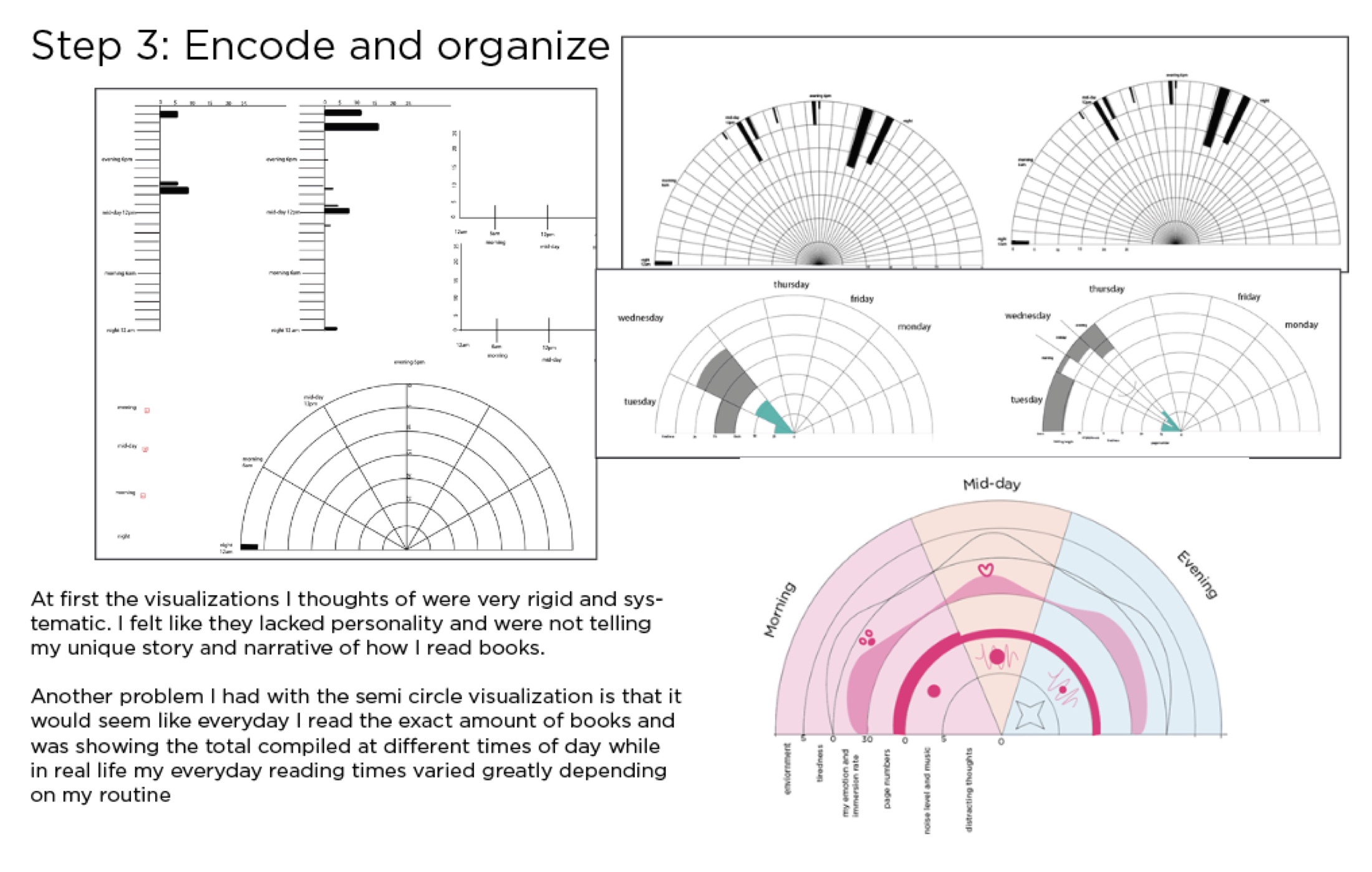
process
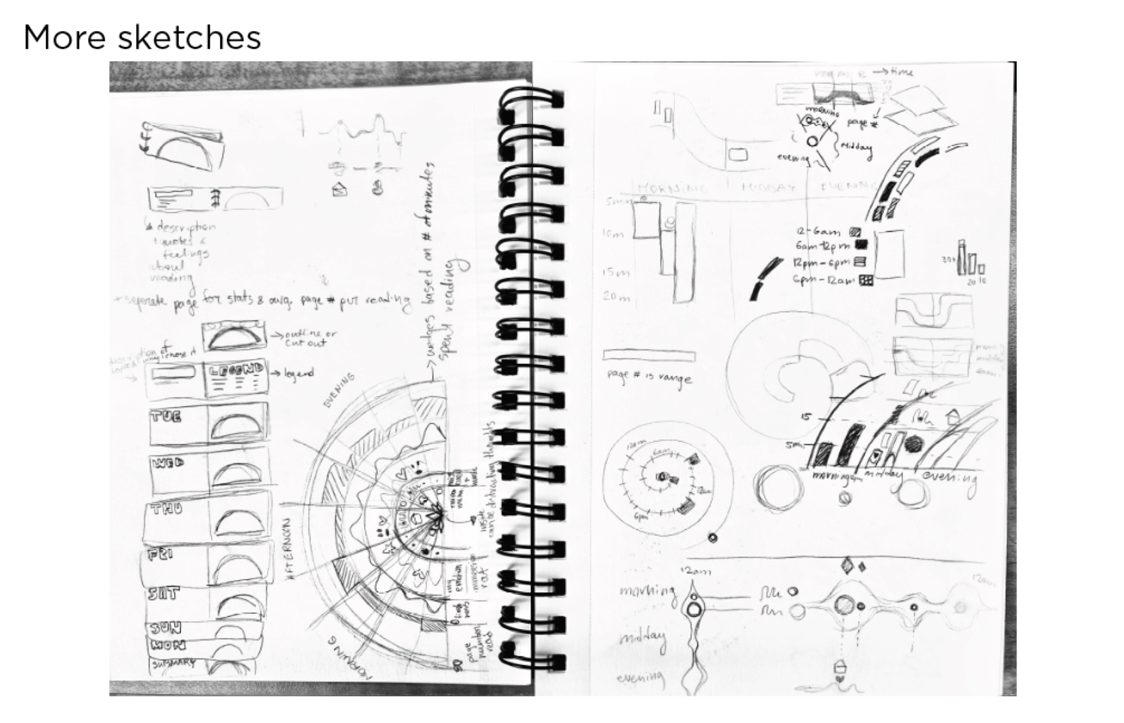
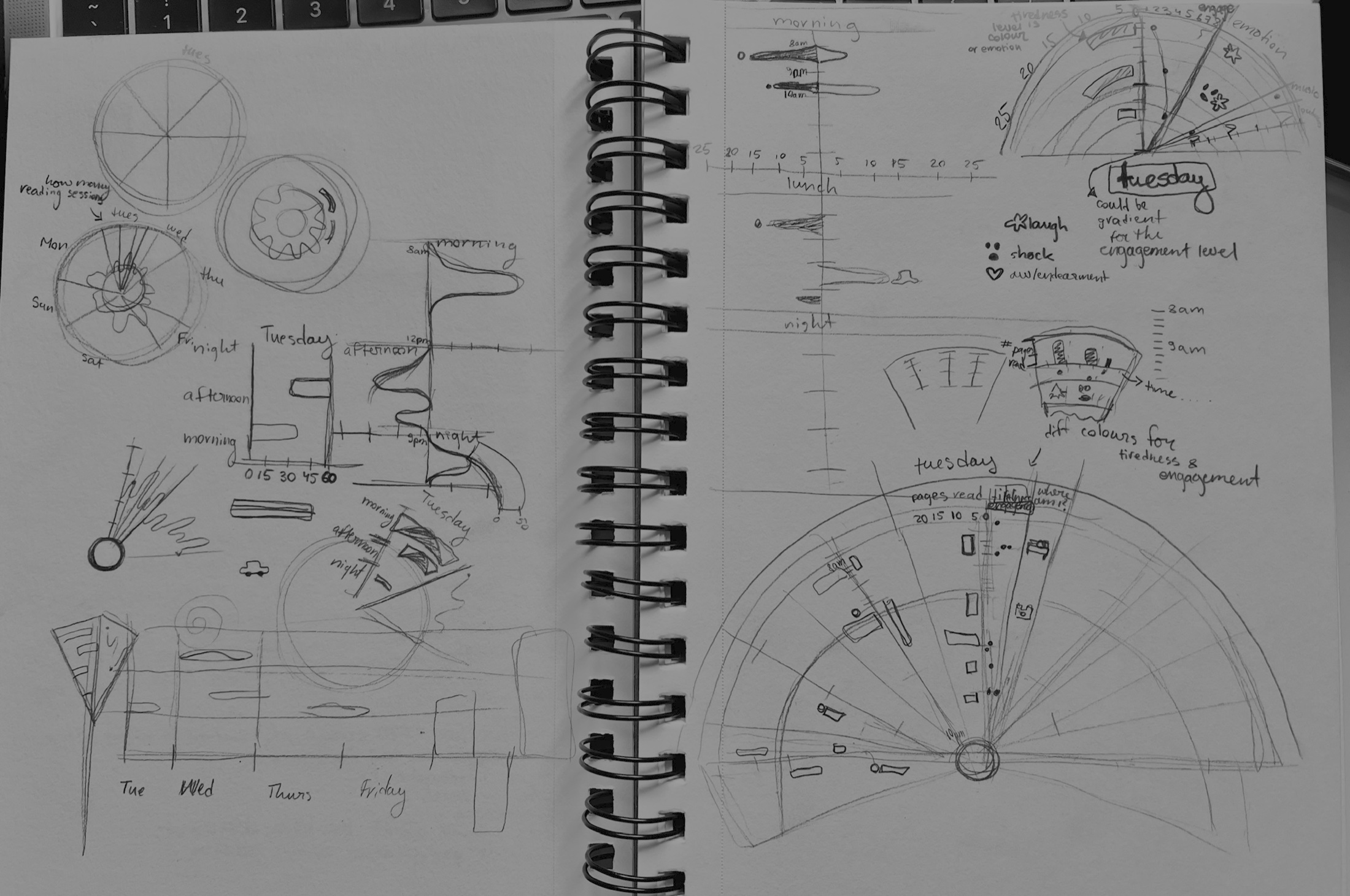
initial sketches




visual language
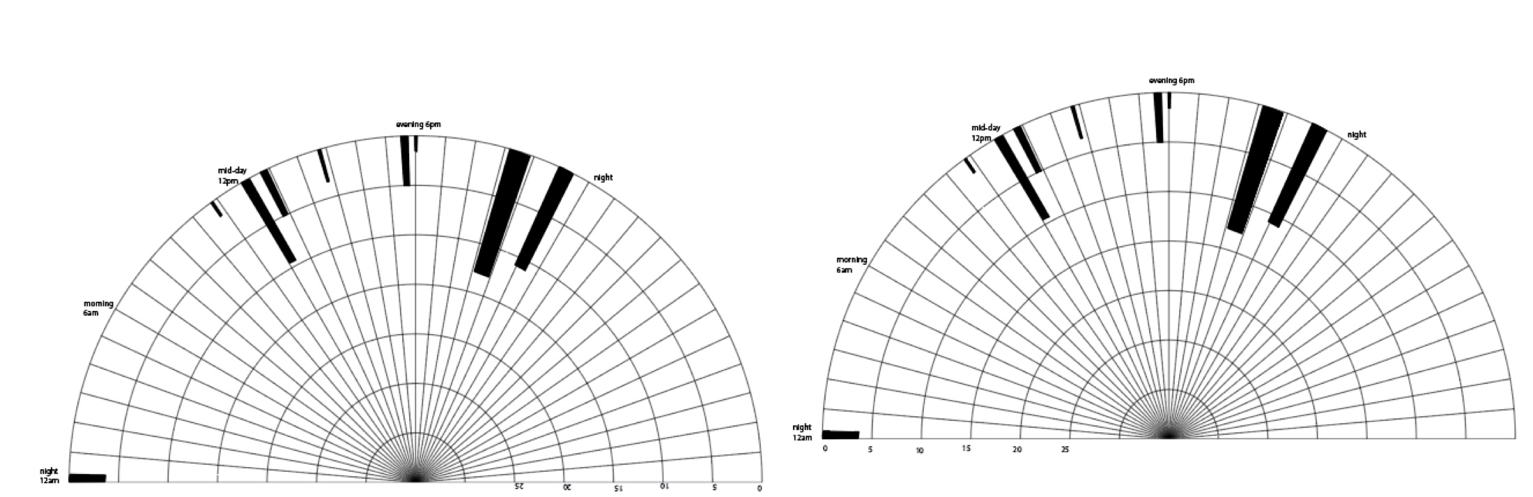
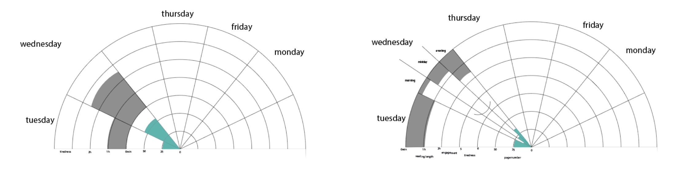
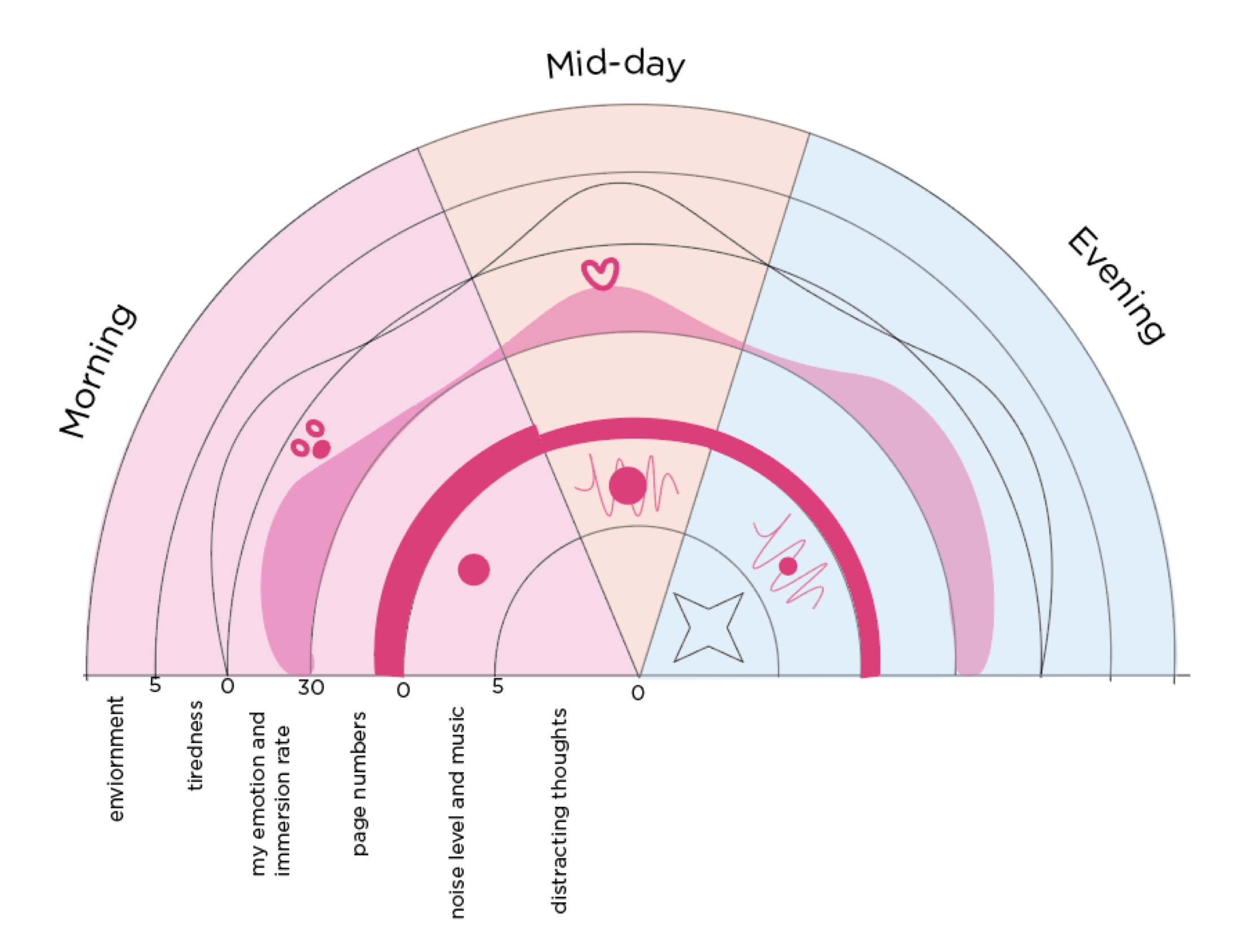
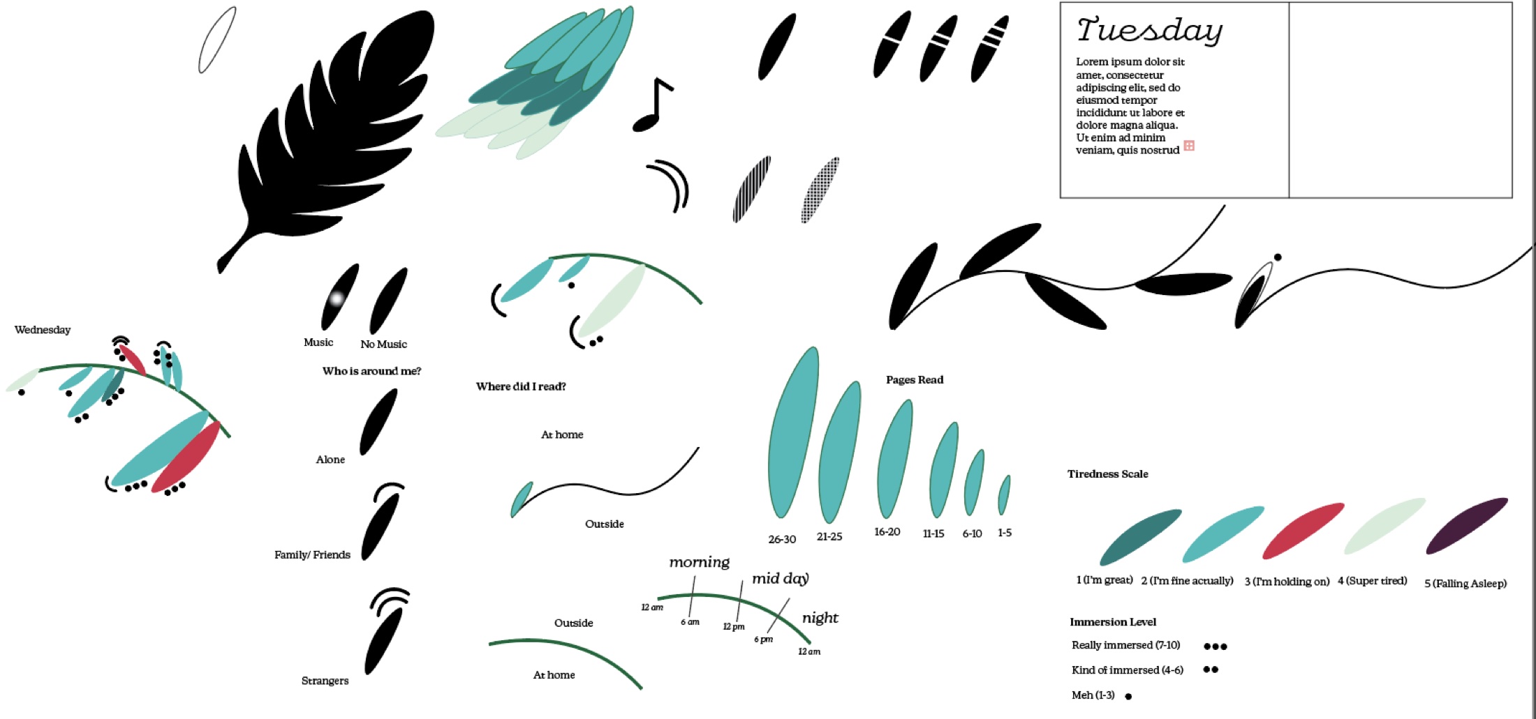
legend
cover ideas
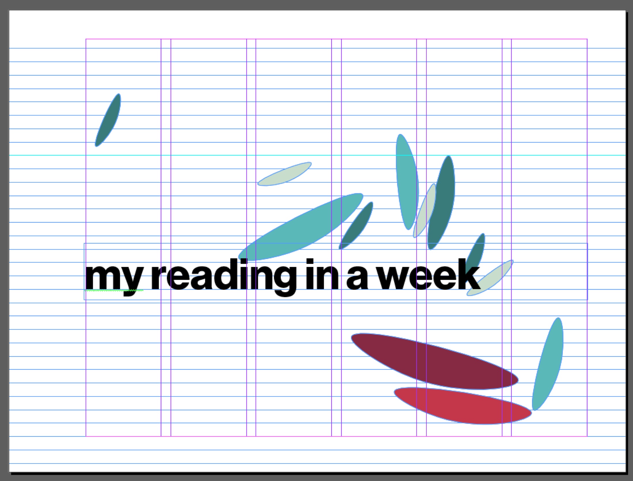
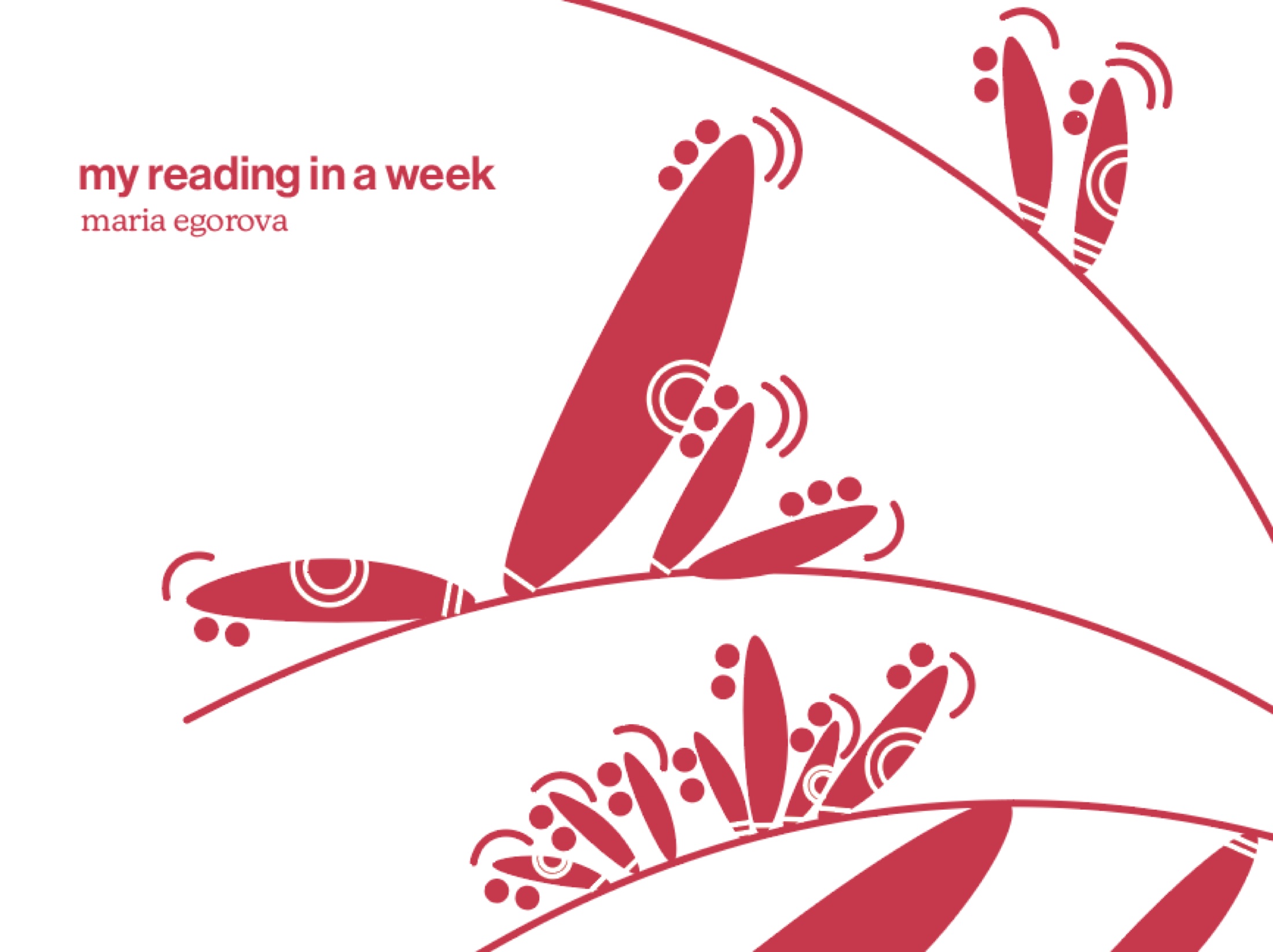
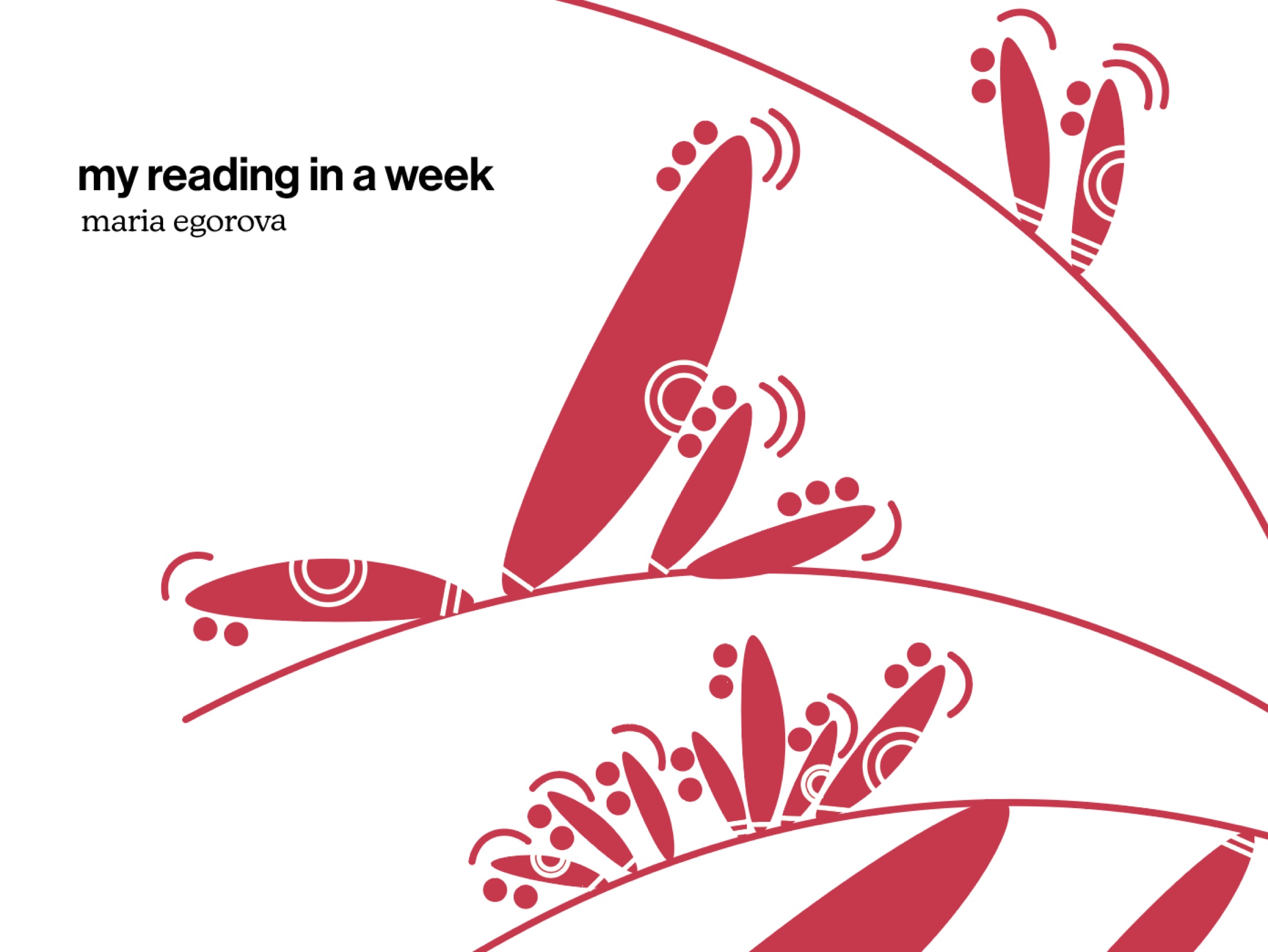
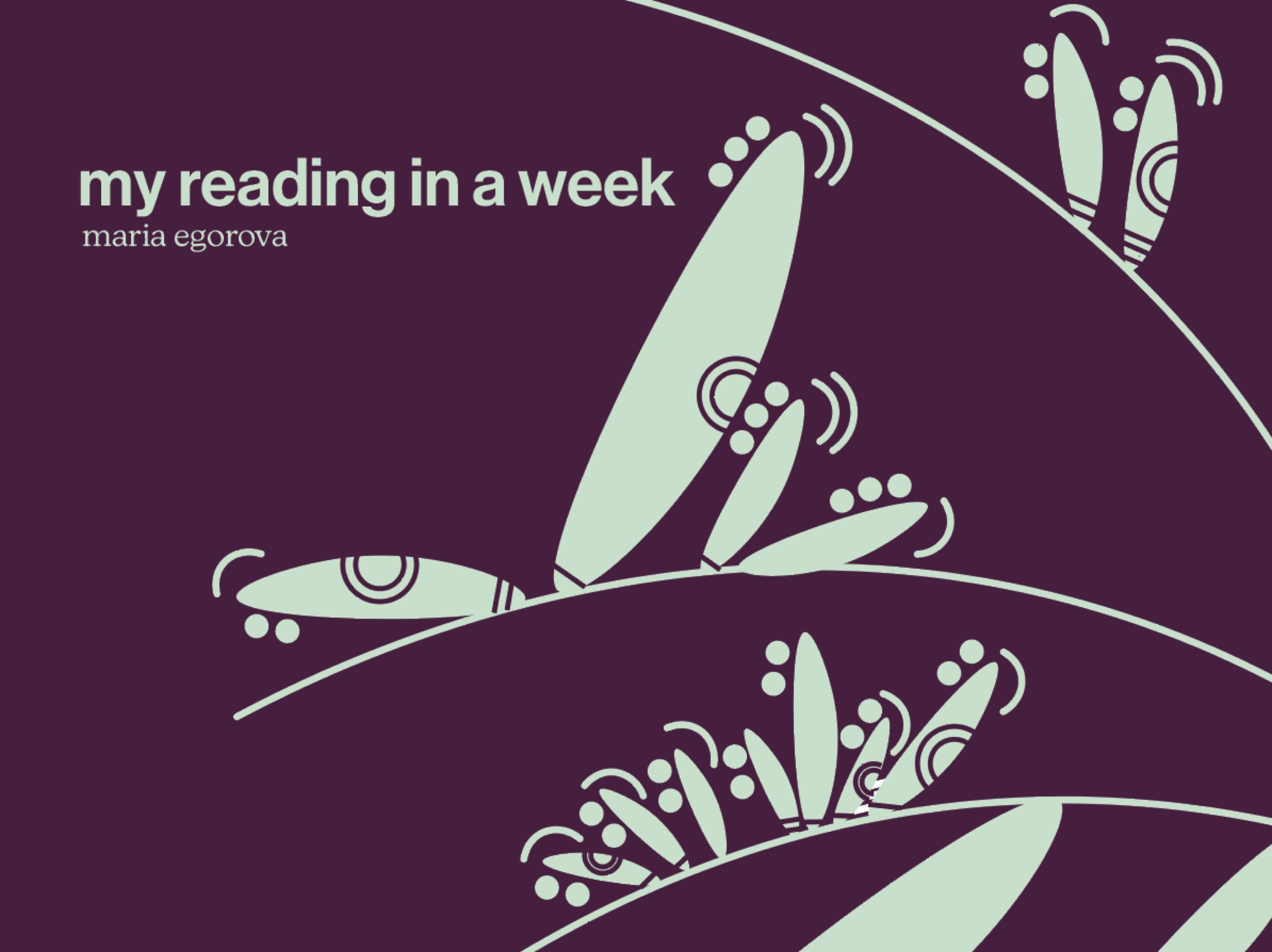
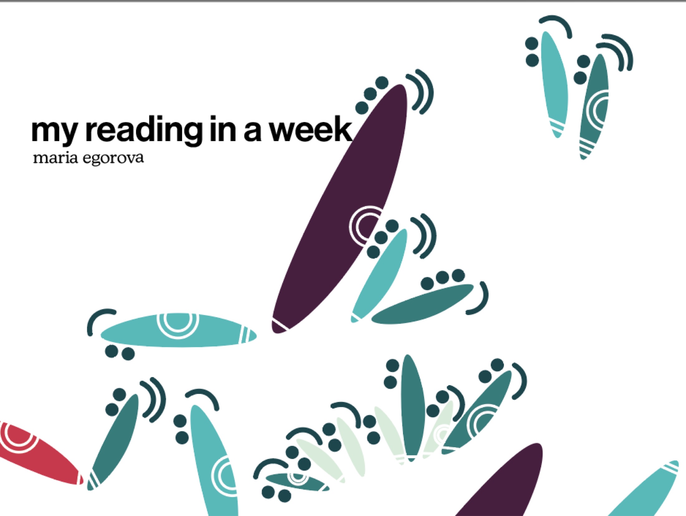
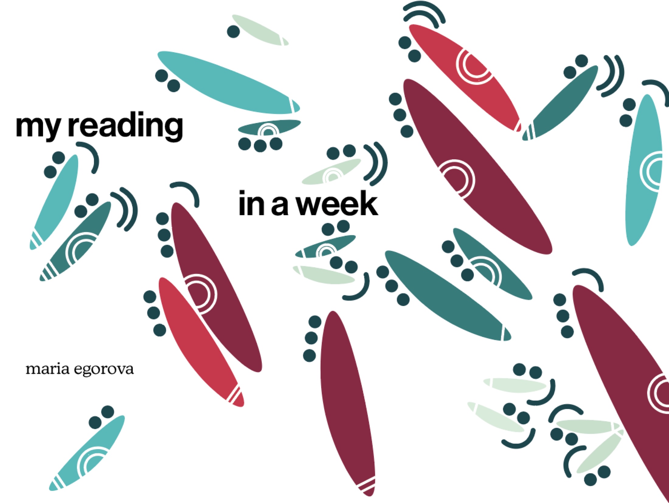
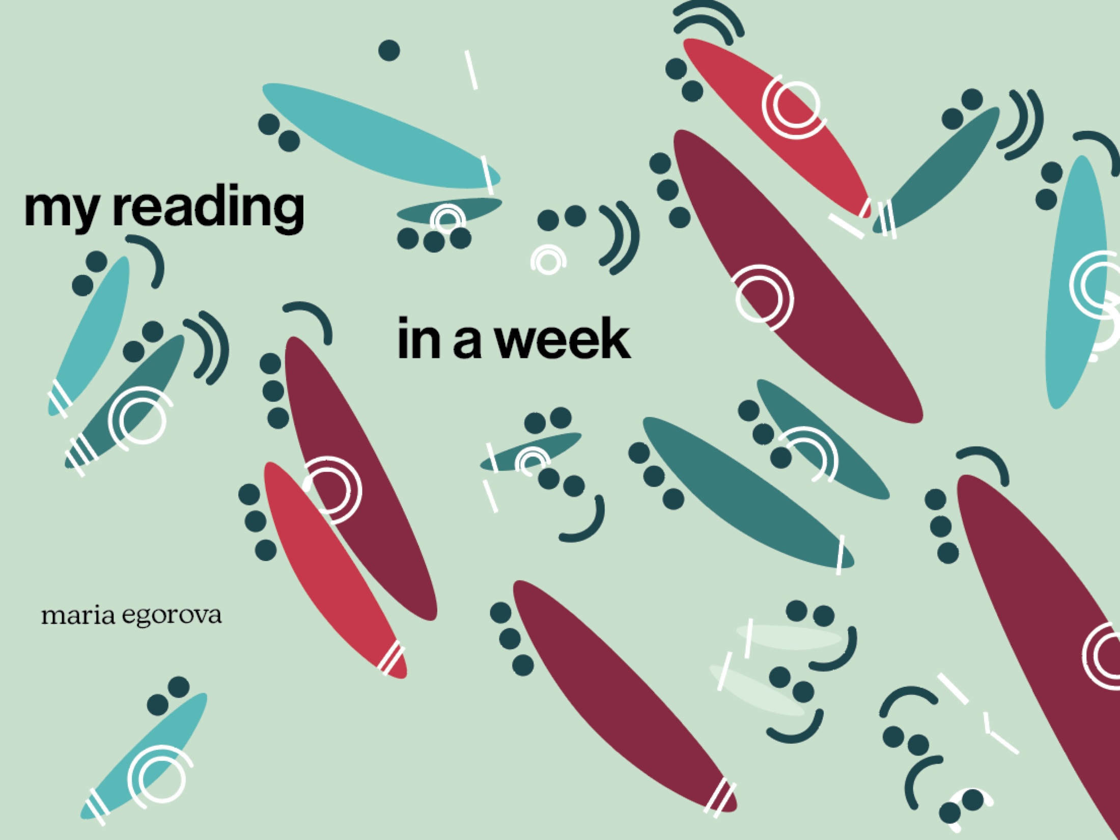
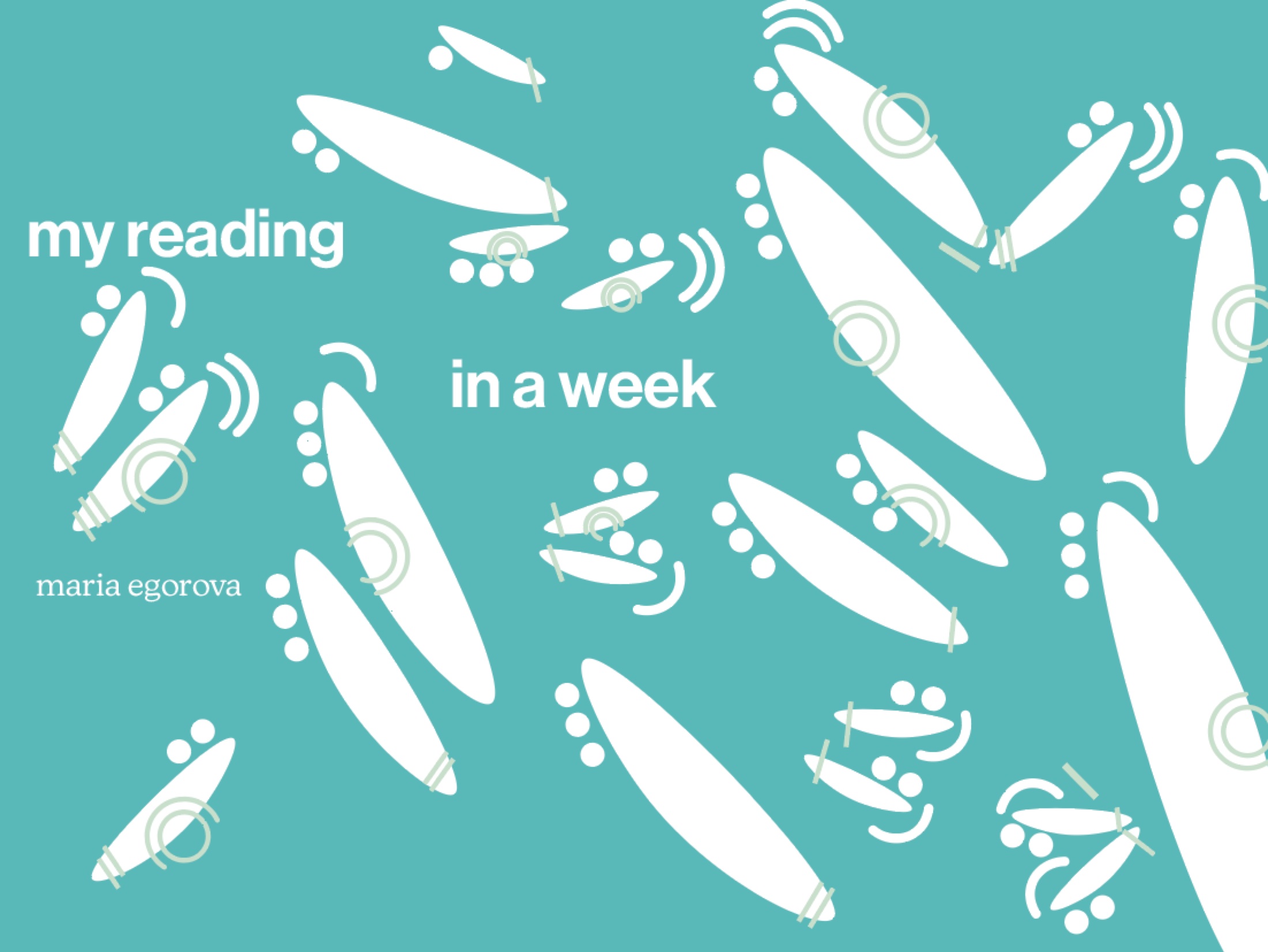
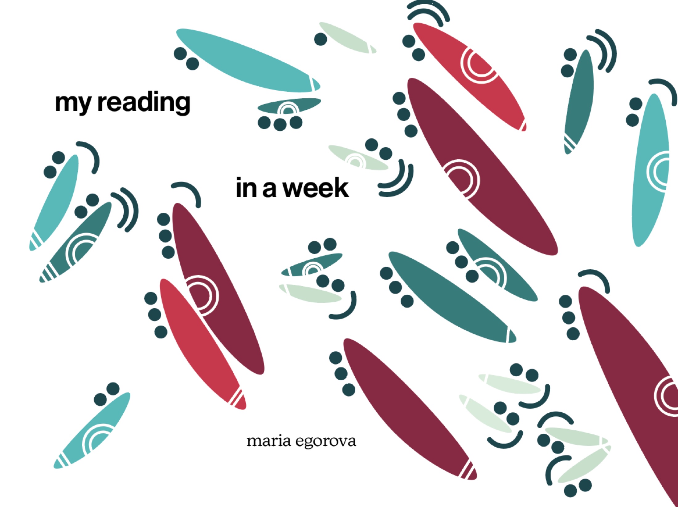
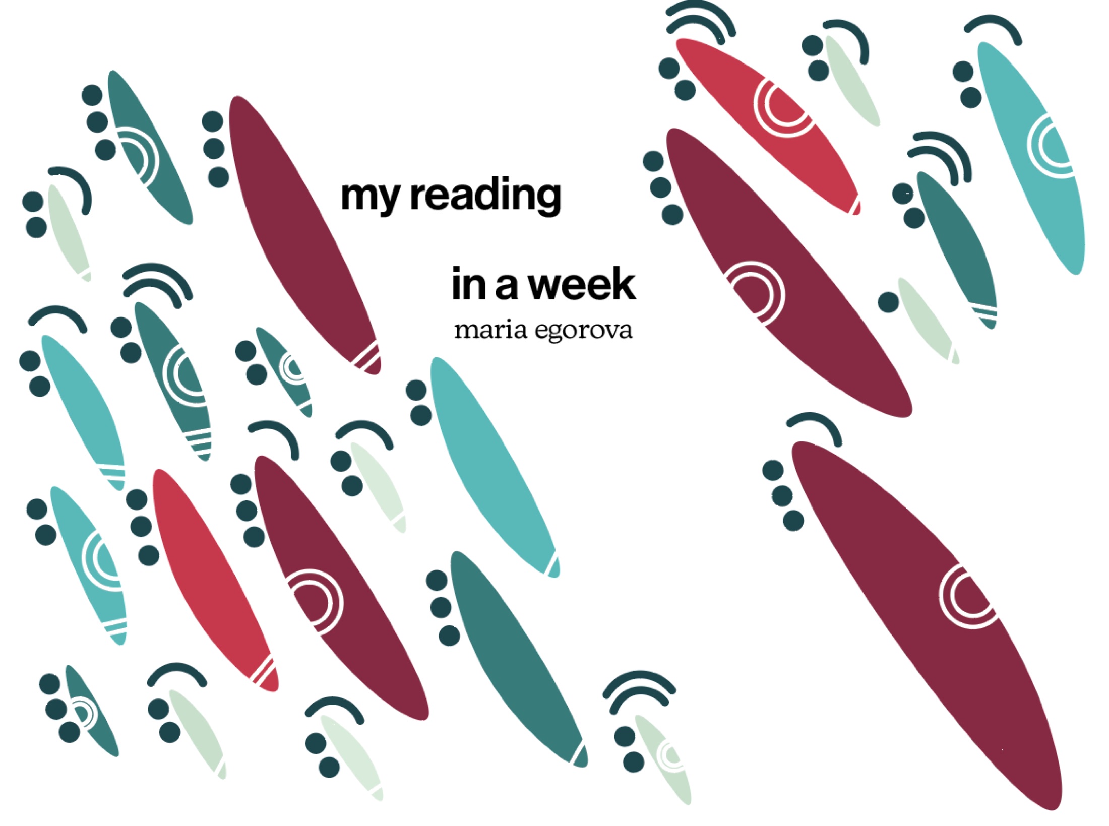
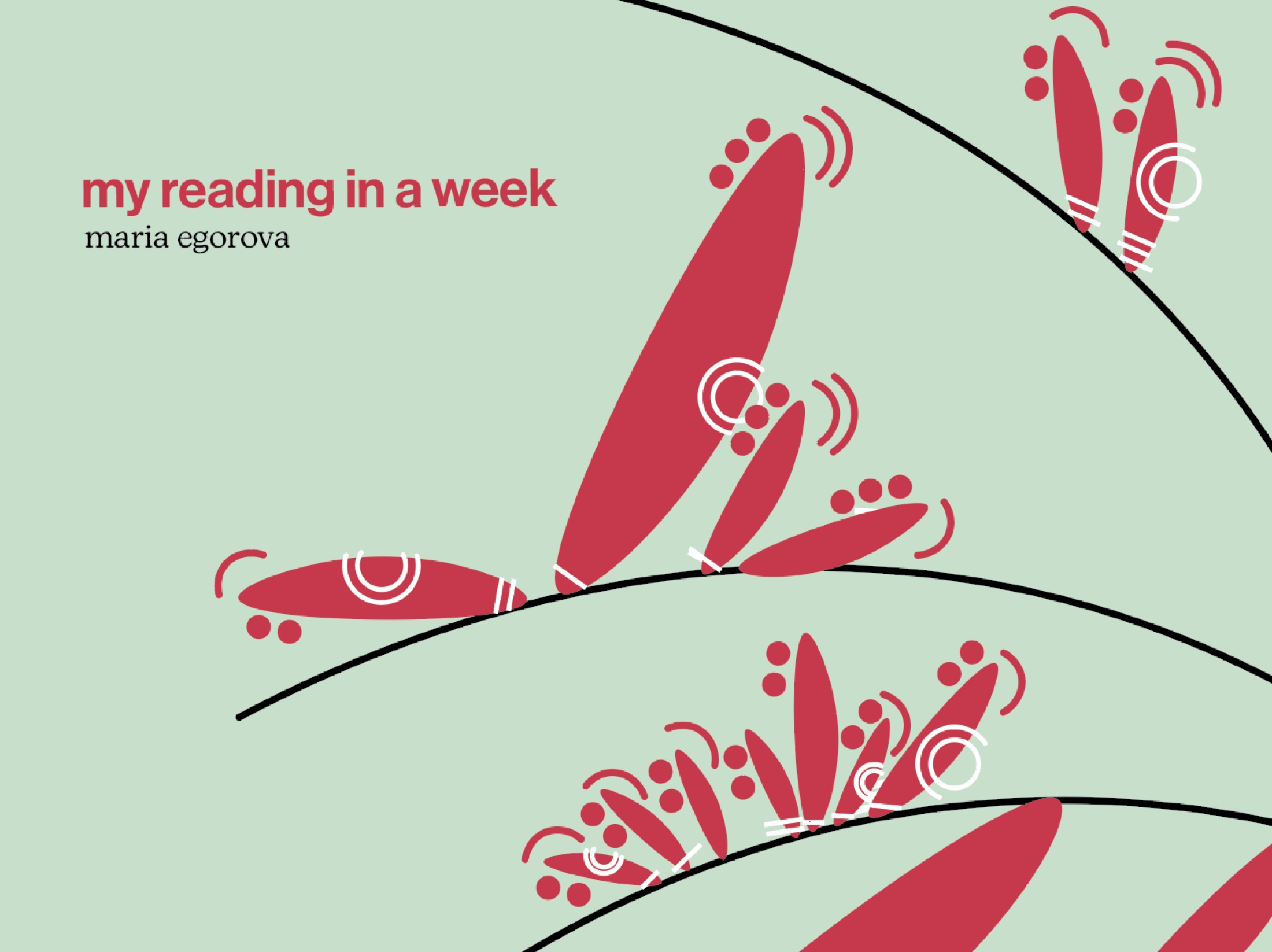
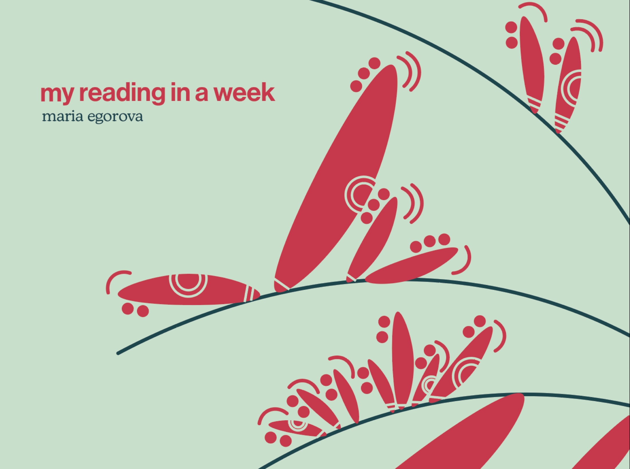
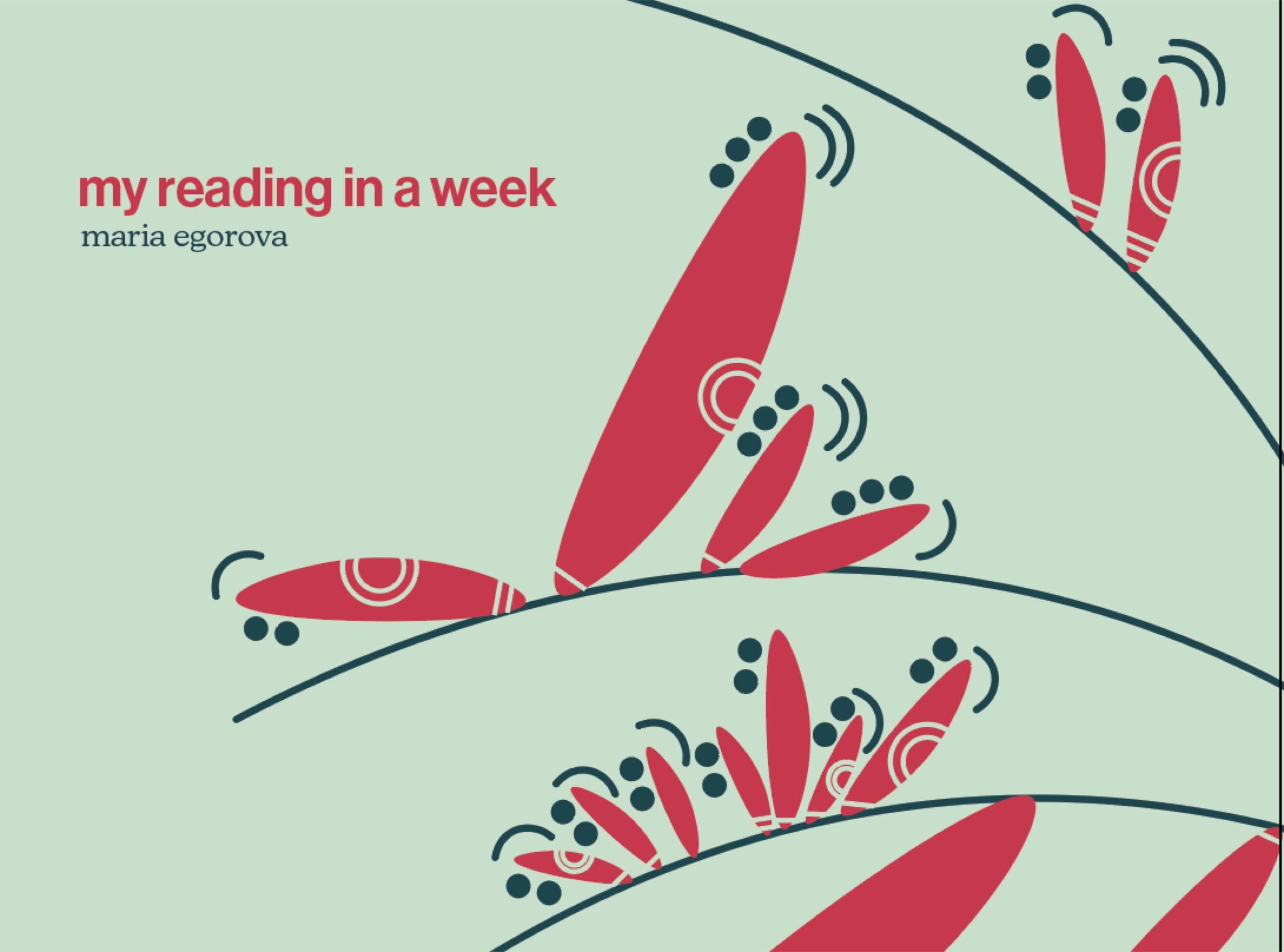
poster iterations